
For starters, UX metrics measure human behavior and attitude toward a particular experience, including aspects of branding, design, usability, and function. UX metrics are also vastly different than metrics used in sales, marketing, or finance. And there’s currently 127 UX KPIs and metrics! So it would take a lifetime to track and measure all of them successfully.
In my previous post, I provided the optimal metrics to track feature-level User Experience (UX) design to track the success (or failure) of product features and user journeys.

Now I’m going review my top 5 metrics to track product-level UX, starting with the most accurate and popular…
1. Customer Satisfaction
Customer satisfaction is probably the best barometer of the quality of the user experience provided by a product or service. After all, a bad experience is unlikely to lead to a satisfied customer. This works by asking users how satisfied they are with particular features, with their experience today, and overall. To combat the large quantity of folks who respond when they’re frustrated, I recommend asking users to rate their experience on a 5-point or 7-point scale, from very dissatisfied to very satisfied.

Surveys are a great way to capture satisfaction ratings, along with feedback provided within an app, or when using a website. It’s important to not only capture ratings, but the reasons behind the ratings by asking for an explanation to their rating.

2. Recommendations
Like Satisfaction, recommendations are also a great way to measure UX. Obviously if a user has a great experience, they’re more likely to recommend that product or service to a friend. Measuring the likelihood to recommend has become an extremely popular business metric, where companies utilize the Net Promoter Score (NPS).
NPS is a simple idea, where you ask customers this single question at the end of a UX test:

When the test concludes, you’ll calculate the NPS score and this will tell you how loyal your customers are using this scoring system:
- Score of 9 – 10: These are your ‘promoters’ and loyal enthusiasts who recommend your product to other people and will continue to use your product in the future.
- Score of 7 – 8: These are your ‘passives,’ where they’re happy with your product but have no real loyalty to you therefore will likely stray.
- Score of 0 – 6: These are you ‘detractors,’ who are unhappy with your product and will likely never use your product again.
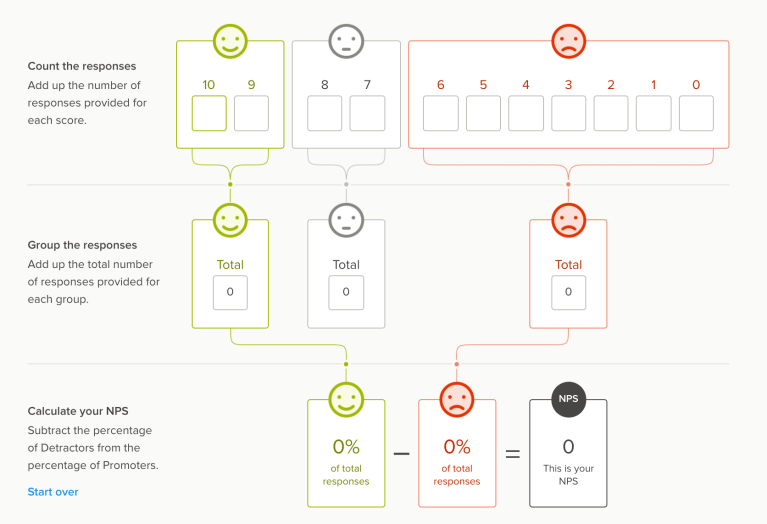 The final NPS score is then calculated by subtracting the percentage of customers who are detractors from the percentage of customers who are promoters.
However, the major caveat to NPS is that it can actually be very misleading!
A recommendation does not necessarily mean a customer had a good user experience, they might just be a loyal follower. On the flip side, a good experience does not always lead to a recommendation if they don’t like a particular brand. Even worse, a NPS score is calculated by subtracting the percentage of detractors from the percentage of promoters. It’s odd that neutrals don’t even matter, which is obviously a gross over simplification.
With that said, I recommend that you use a simple 5-point scale question to measure the likelihood to recommend:

This simplifies the user’s options and makes it super easy to interpret the results.
3. Product Ratings
Ratings are everywhere – from Amazon to TripAdvisor – because they’re a great way to judge the quality of a product or service. To get a better understanding of your product’s usability, you can ask users to provide an overall rating.

Stick with the standard 5-point scale, and if possible, capture not just the ratings, but the reasons behind the ratings by adding an open text field for qualitative feedback.
Note: You can also get feature-level insight by asking users to provide ratings for your primary features or journeys.
4. Product-Level Usability
Usability is important to a product or service in order to understand the effectiveness of a user experience in helping users achieve goals. A good way to capture overall usability is to ask users how they would describe a product, from extremely hard to use to extremely easy to use.

System Usability Scale (SUS) is a great way to determine a high-level view of usability (note: SUS can also be used for feature-specific view of usability).
SUS clearly indicates whether a product has improved over time or it can even compare usability between dissimilar products. It’s highly popular because it’s very easy to administer, can be utilized with a small sample size, and where you can quickly run a range of tests on different assets, or the same asset over a period of time, and compare the SUS score.
However, SUS won’t tell you what’s wrong with your product – it simply classifies its ease of use, which is fine for the purpose of measuring the improvements of a specific feature or journey. User testing will tell you how to improve.

SUS consists of 10 survey questions (template available via usability.gov) that are asked following usability testing, where users rate their level of agreement on a five-point Likert scale (assigning a quantitative value to qualitative opinions). The questions – preferably randomized – cover a range of usability areas and help quantify the qualitative data, like user’s perceived satisfaction of the product.
The SUS scoring mechanism is a little confusing since the score is on a scale from 1 to 100, where a higher score means a better usability rating. Here’s the SUS scoring process: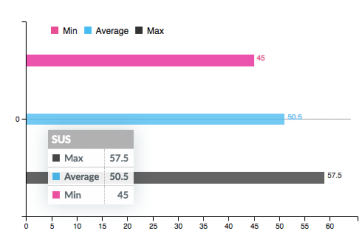
The participant’s scores for each question are added together, and then multiplied by 2.5 to convert the original scores of 0-40 to 0-100. It’s a relative score, so don’t ever convert the score to a percentage or bad things happen!
A SUS score above a 68 is considered above average and anything else below average. A SUS score is great for benchmarking usability, such as in comparison to the product prior to a change, or against competitors’ products, features, and/or services.
5. Average Order Value (AOV)
AOV means average order value, and this is simply your total revenue / number of checkouts, which is a good profitability indicator. If your UX efforts directly tie into increasing cross-selling or upselling, then AOV can be an indicator of whether you’ve improved things or not.
