
As I mentioned in my first post on Design Principles…
Design Principles are first principles that serve as the design foundation for a project in the form of design recommendations that guide each design decision your design team makes as they’re working on a design project – providing the necessary focus to create a kick*ss aesthetic and experience that’s consistent throughout the product that your users will absolutely love.
Design Principles are an extraordinary tool that I utilize on all of my design projects, because they really help designers go beyond the basics of product design (i.e. enhancing usability, increasing engagement, etc.) to mashup the business of design with your specific goals/needs/wants of your customers.
Design Principles are really the essence of design leadership.
Let’s take a look at a few truly inspiring examples of Design Principles…
Example #1: Spotify Design Principles
In 2019, the members of the Spotify working group—about a dozen product designers and UX writers—got together to tackle the development of new design principles in a collaborative workshop. The aim was to get contributions from everyone in the group, instead of having one person articulate “this is what Spotify design should be.”
They used three guiding questions to keep them focused:
- Why are we creating these design principles?
- Who are they for?
- How will they be used?
After some lively debate, they agreed that principles serve as a framework to create and evaluate work—they can help product designers make design decisions, and give them a shared language for design critiques. The real challenge was defining what the new principles should be. What kind of values and design attributes should they aspire to when designing? What should the product feel like?

All the ideas went into a giant matrix, and they dot-voted to help narrow them down. Based on this, they came up with a draft of the new principles, shared it with their design leadership team, and did some fine-tuning.
And voilà! Their new set of Spotify design principles were born.

Relevant – It’s about reflecting you as an individual.
Spotify is made for you—we want it to feel personalized. To be relevant, we need to be thoughtful about what we present, to whom, and in what context. In simpler terms, it’s relevant when we present the right info at the right time. The opposite value is that we don’t want “one-size-fits-all” experiences.
Human – It’s about communication, expression, and human connection.
Yes, Spotify is rooted in technology. But it’s all about people. Sometimes we dial up the emotion, and sometimes we stick to logic—just like people do. Spotify should feel dynamic, like culture itself. A way to see this is that human experiences are intuitive and conversational. It’s not human when things are overly clever, technical, or overly functional.
Unified – It’s about how our brand manifests across our features and apps.
Everything we design looks and feels reassuringly Spotify. We aim for coherence across products as a way to build familiarity and trust. That’s why we follow our design system—we start by reusing rather than reinventing. We want our experiences to reuse and adapt for consistency; nobody should be reinventing the wheel.


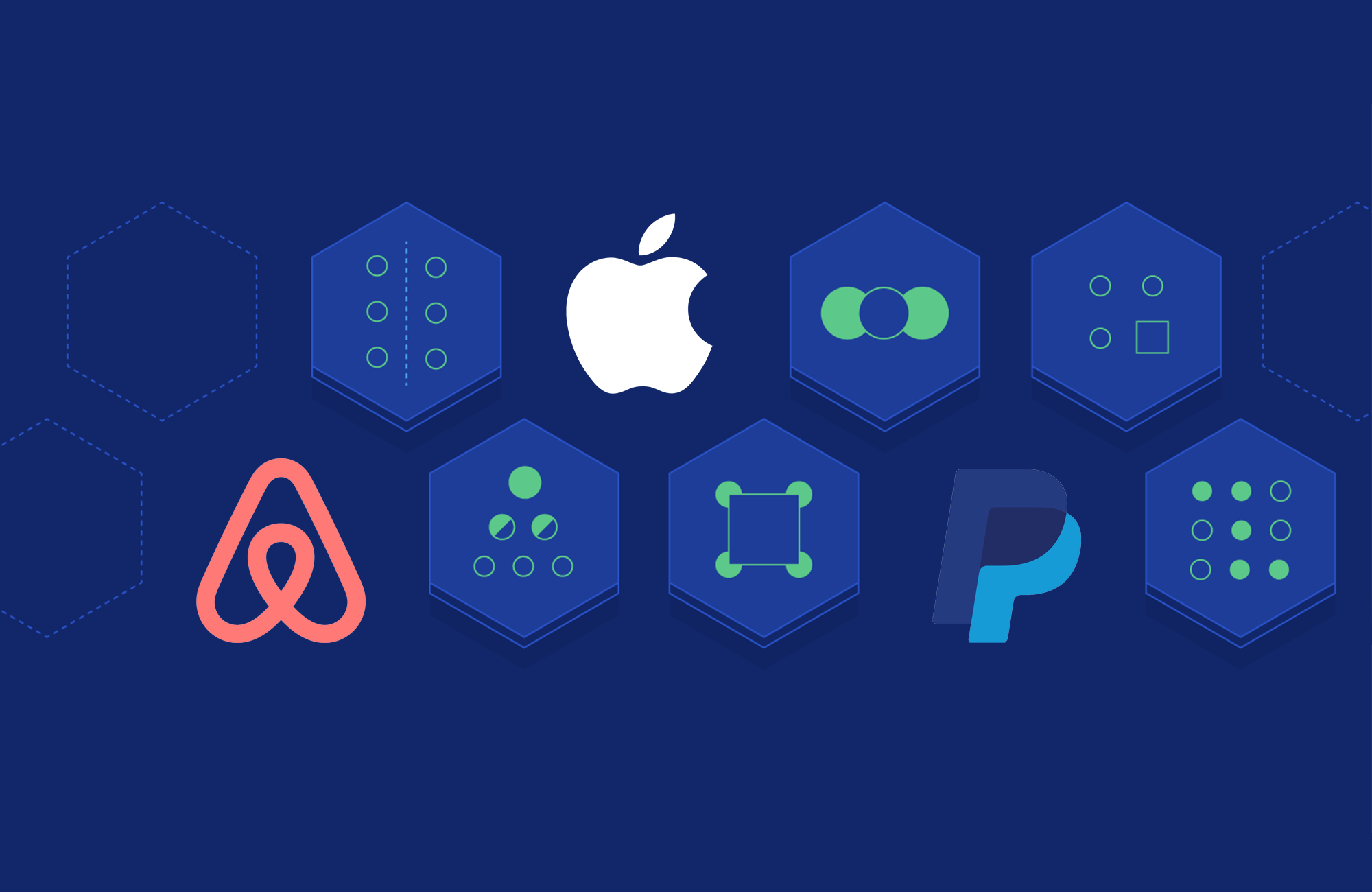
Example #2: Airbnb Design Principles

Airbnb was very ambitious and it required them to rethink some of the ways they worked. By focusing on the methods of working across disciplines, building better tools, and creating a unified system, they can now maximize their time to apply creativity to solve bigger challenges. This all started by creating design principles to guide their thinking and the development of their products.
Unified: Each piece is part of a greater whole and should contribute positively to the system at scale. There should be no isolated features or outliers.
Universal: Airbnb is used around the world by a wide global community. Our products and visual language should be welcoming and accessible.
Iconic: We’re focused when it comes to both design and functionality. Our work should speak boldly and clearly to this focus.
Conversational: Our use of motion breathes life into our products, and allows us to communicate with users in easily understood ways.

Example #3: Paypal Design Principles
We Craft: We obsess over every pixel. Every word. Every experience. We make big changes in tiny spaces and small tweaks to global ideas. We won’t release anything we’re not proud of. Because focusing on the details lets us build something truly memorable.
We Simplify: Building something simple is anything but. So, we’re honest about our impact on people’s lives. We respect their time and spend every waking moment of our day making things simpler. Because simple is loved, needed, used, and shared.
We Connect: We create opportunity by connecting people to each other. That’s a powerful concept–coming up with ways to connect and further interconnect our world anyway we can. It’s an awesome challenge, too. One we dive into headfirst every day.
We Go All In: We invent, then reinvent. Design, then redesign. Yes, we butt heads sometimes, but only because we’re fighting for the people that depend on us. Our customers need us to do the best work of our lives so that they can do the best work of theirs.
Example #4: Apple iOS Design Principles

Aesthetic Integrity doesn’t measure the beauty of an app’s artwork or characterize its style; rather, it represents how well an app’s appearance and behavior integrates with its function to send a coherent message.
People care about whether an app delivers the functionality it promises, but they’re also affected by the app’s appearance and behavior in strong—sometimes subliminal—ways. For example, an app that helps people perform a serious task can put the focus on the task by keeping decorative elements subtle and unobtrusive and by using standard controls and predictable behaviors. This app sends a clear, unified message about its purpose and its identity that helps people trust it. But if the app sends mixed signals by presenting the task in a UI that’s intrusive, frivolous, or arbitrary, people might question the app’s reliability or trustworthiness.
On the other hand, in an app that encourages an immersive task—such as a game—users expect a captivating appearance that promises fun and excitement and encourages discovery. People don’t expect to accomplish a serious or productive task in a game, but they expect the game’s appearance and behavior to integrate with its purpose.
Consistency lets people transfer their knowledge and skills from one part of an app’s UI to another and from one app to another app. A consistent app isn’t a slavish copy of other apps and it isn’t stylistically stagnant; rather, it pays attention to the standards and paradigms people are comfortable with and it provides an internally consistent experience.
To determine whether an iOS app follows the principle of consistency, think about these questions: Is the app consistent with iOS standards? Does it use system-provided controls, views, and icons correctly? Does it incorporate device features in ways that users expect?
Is the app consistent within itself? Does text use uniform terminology and style? Do the same icons always mean the same thing? Can people predict what will happen when they perform the same action in different places? Do custom UI elements look and behave the same throughout the app?
Within reason, is the app consistent with its earlier versions? Have the terms and meanings remained the same? Are the fundamental concepts and primary functionality essentially unchanged?
Direct Manipulation allows people to configure onscreen objects instead of using separate controls to manipulate them, which keeps them more engaged with their task and it’s easier for them to understand the results of their actions.
Using the Multi-Touch interface, people can pinch to directly expand or contract an image or content area. And in a game, players move and interact directly with onscreen objects—for example, a game might display a combination lock that users can spin to open.
In an iOS app, people experience direct manipulation when they:
Rotate or otherwise move the device to affect onscreen objects
Use gestures to manipulate onscreen objects
Can see that their actions have immediate, visible results
Feedback acknowledges people’s actions, shows them the results, and updates them on the progress of their task.The built-in iOS apps provide perceptible feedback in response to every user action. List items and controls highlight briefly when people tap them and—during operations that last more than a few seconds—a control shows elapsing progress.
Subtle animation can give people meaningful feedback that helps clarify the results of their actions. For example, lists can animate the addition of a new row to help people track the change visually.
Sound can also give people useful feedback, but it shouldn’t be the only feedback mechanism because people can’t always hear their devices.
Metaphors used for virtual objects and actions in an app to highlight familiar experiences—whether these experiences are rooted in the real world or the digital world—users quickly grasp how to use the app.
It’s best when an app uses a metaphor to suggest a usage or experience without letting the metaphor enforce the limitations of the object or action on which it’s based.iOS apps have great scope for metaphors because people physically interact with the screen. Metaphors in iOS include:
Moving layered views to expose content beneath them
Dragging, flicking, or swiping objects in a game
Tapping switches, sliding sliders, and spinning pickers
Flicking through pages of a book or magazine
User Control allows people—not apps—should initiate and control actions. An app can suggest a course of action or warn about dangerous consequences, but it’s usually a mistake for the app to take decision-making away from the user. The best apps find the correct balance between giving people the capabilities they need while helping them avoid unwanted outcomes.
Users feel more in control of an app when behaviors and controls are familiar and predictable. And when actions are simple and straightforward, users can easily understand and remember them.People expect to have ample opportunity to cancel an operation before it begins, and they expect to get a chance to confirm their intention to perform a potentially destructive action. Finally, people expect to be able to gracefully stop an operation that’s underway.
Conclusion
Design principles are aimed at helping designers find ways to enhance usability, influence perception, increase appeal, teach users, and make sound design decisions during projects. These incredible examples from Spotify, PayPal, Airbnb, and Apple really help to tell the story at the intersection of brand, business, products, and design.
Check out these additional links if you’re still in need of design principle inspo:

3 thoughts on “The Best Design Principles Ever Created for Products We Love”