
Large companies have millions of customers engaging with their products and services across a variety of channels each and every day, where one bad interaction can make or break a customer’s experience with them.
Compounding the problem is the fact that companies are collecting vast amounts of customer data, including their product and service interactions, buying preferences, behaviors across channels, customer service interactions, profiles & preferences, indirect tracking (interaction analytics), and third-party data. This makes it almost impossible to look at each interaction individually, or even to understand the individual customer journeys.
Say hello to Data Visualization.
It can help customer-facing teams improve their Customer Experience (CX) and point out the areas for improvement by applying data analytics and machine learning to massive customer datasets. This allows marketing managers, sales representatives, and customer service professionals to process a rapid flow of information to decrease the waiting time for every customer. It also helps them understand what customers need during these interactions.

Let’s discuss a few ways in which data visualization can help organizations do better when it comes to CX and overall customer satisfaction…
Enhance Customer Engagement with Data Visualization
Just a few years ago, customer service was based on static texts and automated one dimensional encounters. Today, the visualization of big data has taken CX to a whole new level of engagement.
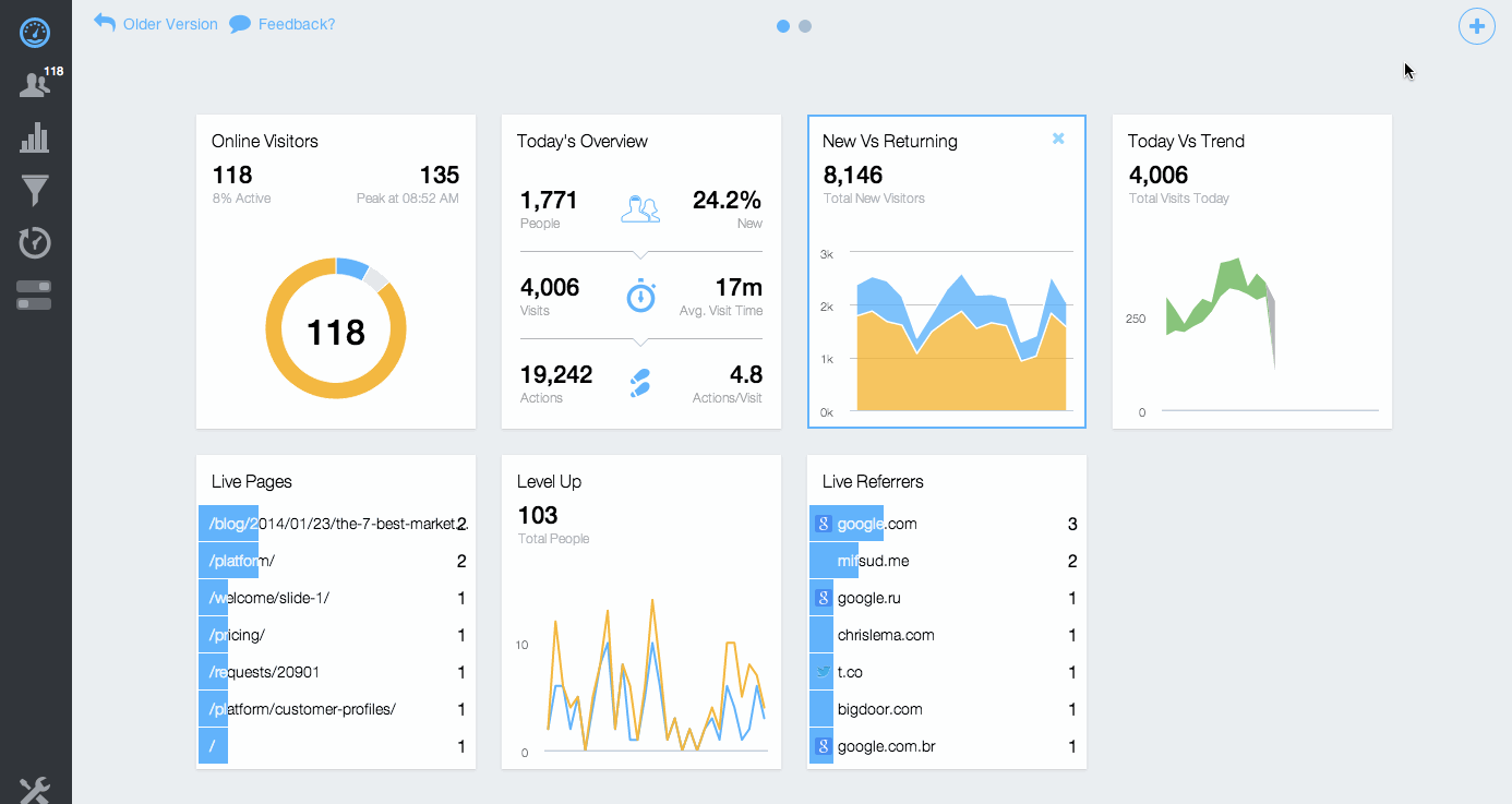
Businesses are using different visualization techniques to promote engagement with their customers. For example, utilizing real-time dashboards or monitoring live sessions, where they get updates when the customers perform important activities and/or have issues within a customer journey. This enables product, marketing, and customer service teams to make quicker and better decisions on how they engage with customers, leading to a much improved customer experience.
Investment centers, credit facilities, and banks have added different data visualization techniques to help customers analyze their expenses. This could be in the form of a pie chart or trending graphs to differentiate between their spending and saving allocations. The concept is based on reaping the full benefits of the data present in a customer’s financial statements and creating a customer centric design that meets their needs.
Analyzing Product Performance
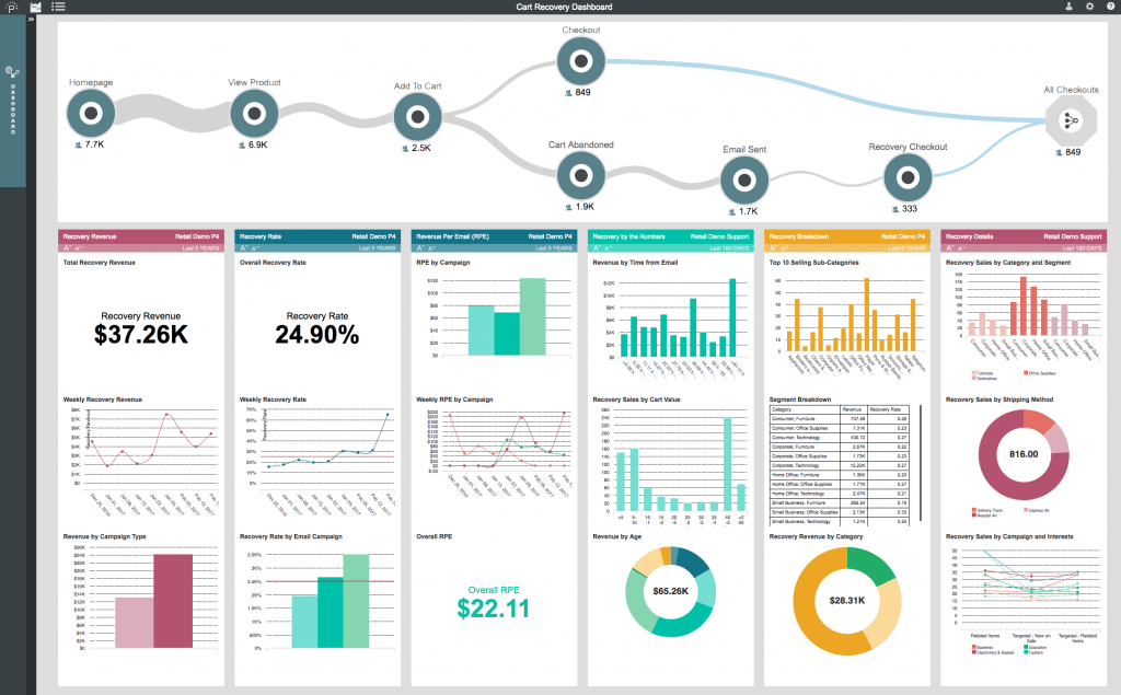
Data visualization has played an important role in elevating the customer experience to new heights, especially in analyzing the performance of a product or service. It helps to identify and track customer issues, customer engagement, and even runtime performance. Diving deeper, it enables both macro (i.e. all customers) and micro (i.e. individual customer) behavior trends about specific products or services. These data points give actionable insights so that companies can quickly react and adapt to the needs of their customers.
Understand Data Consumption Objectives
With enough customer engagement data, data visualization tools can help customer service professionals understand and answer what data or information does a user need to access? When and Why? What is the smallest amount of data that will help answer the user’s question? These are some of the questions that data visualization answers.
Increasing Engagement with Customer Analytics
Displaying customers’ product data to them via dashboards has provided new opportunities for engagement. A number of businesses and industries are following this trend of showing customer’s individual usage stats, information, benchmarking, and data trends using a dashboard on their products based on customer feedback and demand.
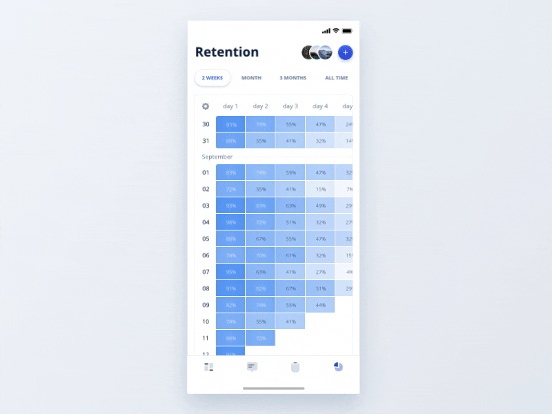
Even with mobile devices, presenting important customer data to the customer can be accomplished with data visualization. I highly recommend using several of these visualization techniques in combination to enhance data intuitiveness while optimizing customer engagement:
- Sparklines
- Small multiples
- Geospatial
- Time series
- Multiple chart types
- Filters
- Animations
- Iconography
- Identify data types with colors
Identify Customers with Recurring Issues

Another priority for designing exceptional customer experiences is identifying customers who are experiencing recurring issues (e.g. payment issues, 404 errors, login problems, etc.). Attaching unique codes helps to identify and track individual customer interactions for issue tracking throughout their interaction with the product or service, where data visualization can help customer service teams quickly identify and isolate these issues from other normal interactions and take action with the customer.
Data Visualization is gradually becoming an integral part of company operations as means to understand big data. Nowhere is it more needed than in dealing with customer service complaints. This data has to be available in real time and analytics tools help to ensure that high priority customers don’t get missed. This enables customer service professionals to handle their interactions with customers in a better way, reducing response times, and providing more transparent communications.
Conclusion
Customer Experience is key to success in business, and Data Visualization is a critical component to deliver consistent customer experiences as well as providing healthy growth of your app’s popularity and even monetization.
Good data visualization enables mobile app users to see connections in their data more efficiently, which improves their understanding and helps them to effectively manage their own needs. Data visualization in banking and investment apps, for example, can help users identify problems with their account, spending patterns, and identify areas for improvement. Even simpler, good graphs generate higher levels of customer satisfaction, all of which stimulates increased user engagement with the app and its features.
Additionally, it can help reverse a high customer churn rate by providing customers with actionable insights directly relevant to your product or service. Consumers will be encouraged to stick to your app if your data visualization creates positive outcomes, practically and emotionally.
Organizations that use data visualization and business intelligence will see extraordinary improvements over those who don’t use these tools.