
In 2024, I’m predicting dynamic and adaptive interfaces utilizing AI will become the cornerstone of personalized user experiences, and designers will become more enlightened this year as we advance ecological and social sustainability in our designs.
We continue to elevate our designs with liquid & dynamic gradients, powerful storytelling inspired by Pixar, and we’ll tackle complexity with Object-Oriented User Experience (OOUX) process.
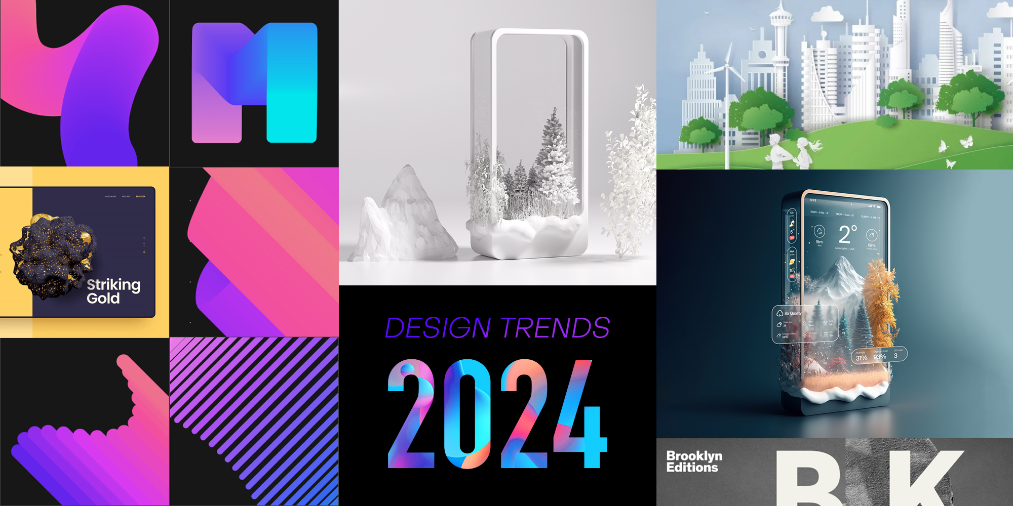
Let’s launch the new year with some awesomeness in design trends ahead for 2024!
01. Personalized User Experiences Utilizing Adaptive & Contextual AI
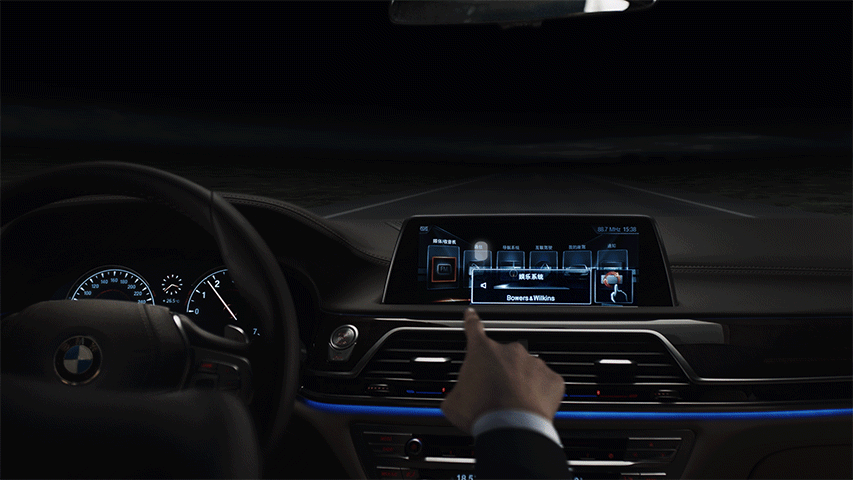
I’m predicting in 2024 that dynamic and adaptive interfaces will become the cornerstone of personalized user experiences, where you’ll see more experiences that not only adapt to user preferences and devices but also to environmental factors like day/night, seasonal/weather patterns, lighting levels, noise/sound levels, pollution, people density/traffic, and much more. This approach marks a transformative change in design philosophy, emphasizing hyper-personalized, context-sensitive interactions. It’s also particularly important in creating inclusive designs that cater to a diverse range of users with different needs and preferences, making technology more accessible and user-friendly for everyone.

I personally love this new tool in the designer toolkit, where it’s fun to think of all of the rich and dynamic experiences we can create for our users!

Imagine a person using a reading app that adjusts its background and text size based on the ambient light or a music app that changes its interface based on the tempo of the song being played. Or even a travel/hotel app that adjusts its color scheme based on the user’s location to match the local culture.
For designers, the best way to create these extraordinary experiences is to explore the space between Dynamic UI, Adaptive UI, Intelligent UI, and Contextual UX.
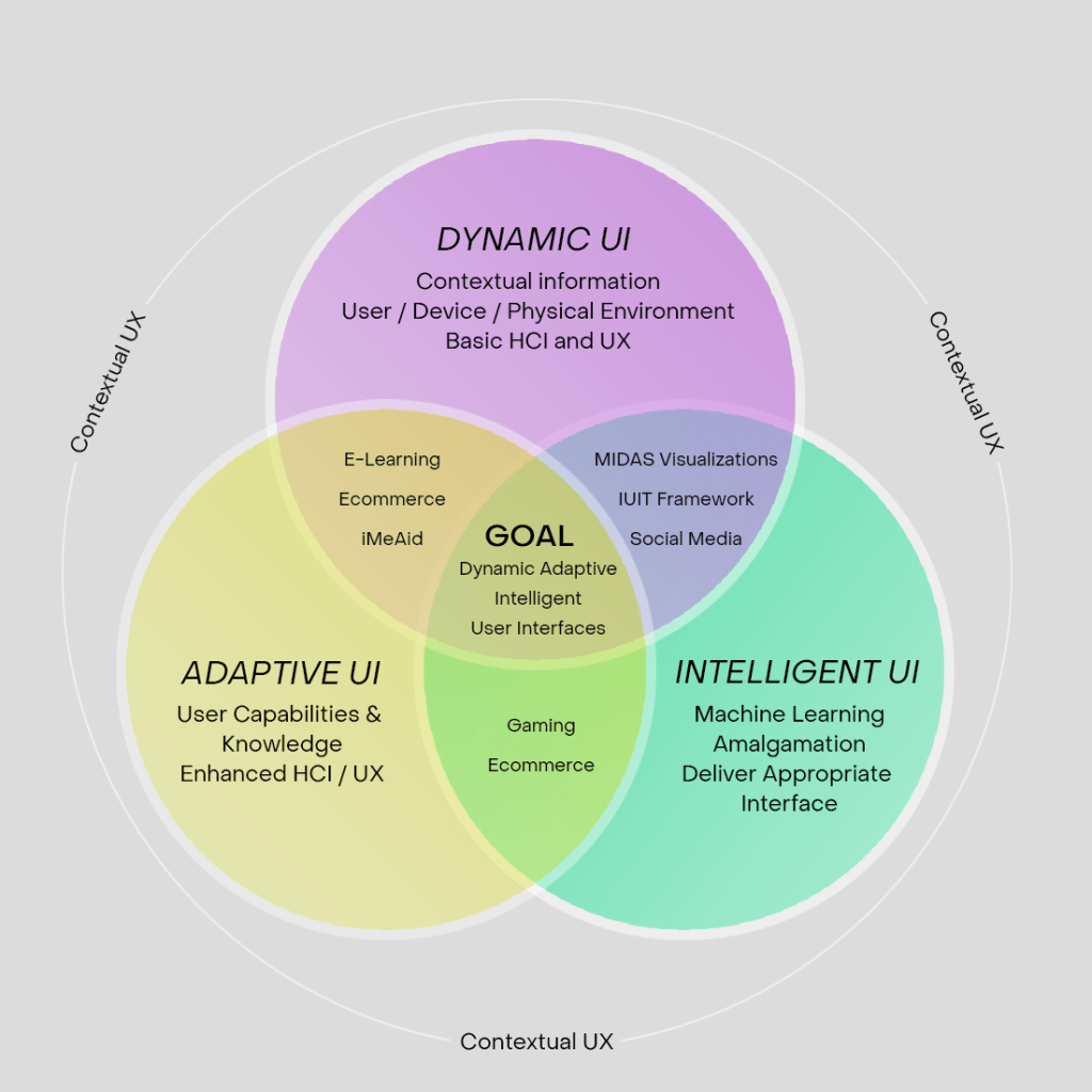
Dynamic UI
Dynamic user interfaces (also known as dynamic UI’s), are web pages generated dynamically according to the specifications of an existing page definition. These interfaces are initiated solely through a portlet utilizing the Dynamic UI Manager API. Due to their dynamic nature, these interfaces are not permanently stored in the portal database and are only active for the duration of the user’s session with the portal. Additionally, users have the option to close the interface before the session concludes, either programmatically or manually.
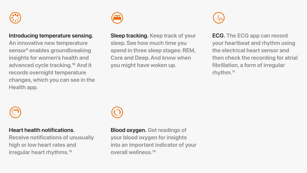
I think the awesome thing about Dynamic UI’s is the number of use cases one could have for mobile & wearable devices, where they track all sorts of measurements. For example, the Apple Watch has several health trackers apps can utilize around temperature, sleep, ECG, heart health, and blood oxygen levels.
Adaptive UI
Adaptive design was introduced by Aaron Gustafson, and refers to interfaces that modify themselves in real-time based on individual user behavior, preferences, and context. These interfaces employ machine learning algorithms and data analytics to deliver a personalized user experience. In other words, the interface learns from the user and adapts accordingly.
Please make sure you don’t confuse Adaptive with Responsive design. The key difference is that Responsive design reconfigures the same web-based content for optimal reading on different devices, where Adaptive design is about tailoring the content & layout to be optimal to each device and user.
Intelligent UI
Intelligent user interfaces use artificial intelligence technologies and machine learning to create personalized experiences for users, with the goal of improving the user’s performance or usability. The technology is used to understand and interpret the user’s intentions and context before providing a tailored or guided experience.

Some examples of intelligent user interfaces could be chatbots, voice assistants, and recommendation systems. One of the more popular executions of this type of technology is personalization engines which are now embedded into many enterprise solutions.
Contextual UX
Contextual UX involves using context-aware technologies to tailor personalized experiences based on specific user situations or contexts. Understanding explicit and implicit interaction concepts in human-computer interaction (HCI) is crucial for effectively exploring this concept.
In today’s connected world, we’re shifting towards contextual UX from task-oriented UX, where systems adapt to user needs based on factors like location. This shift allows for the creation of sophisticated, adaptive systems delivering real-time personalized experiences, often termed the “internet of things” or “ubiquitous computing.” To be successful with contextual UX, it requires systems to adapt to user needs based on situational context, such as a shopping app providing real-time assistance during checkout. Additionally, designers must consider the context effect in UX, ensuring products cater to users’ behaviors and environments, whether on mobile or desktop platforms.
Putting It All Together
Designing personalized user experiences utilizing adaptive and contextual AI involves collaboration between designers, data scientists, and developers. Here’s a step-by-step guide on how designers can contribute to the process:
- Collaborate across design, data science, and development teams
- Understand user needs and goals
- Define personalization goals
- Identify data sources
- Design personalization models
- Prototype personalized experiences
- Iterate based on user feedback
- Ensure accessibility and inclusivity
- Monitor and measure performance
By following these steps and adopting a user-centered approach, designers can play a crucial role in designing personalized user experiences that leverage adaptive and contextual AI to enhance user engagement, satisfaction, and loyalty.
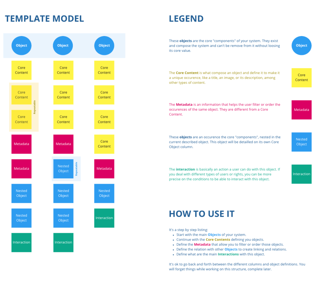
02. Object-Oriented UX (OOUX)
This trend of Object-oriented User Experience (OOUX) is more about improving your design process, which will then help you to simplify the design of complex information architecture, navigation, and user experiences. Specifically, this process will help Information Architects (IA) to object map a system that has tens if not hundreds of legitimately important objects that have complex relationships with one another, but it’s good knowledge for all designers to know how to design for complexity.
OOUX facilitates the creation of circular and context-sensitive navigation systems by establishing connections between various elements, forming a network akin to a “spiderweb” rather than a traditional linear or tree-like structure. And OOUX emphasizes promoting heterarchies, where elements are not hierarchically ranked, allowing for endless possibilities in how they can be organized and accessed.
This is important because we often shy away from complexity by oversimplifying, or worse by adding more complexity to an already exponentially difficult design problem where you need to solve for a massive amount of information & data, multiple user types & goals, multiple devices, multiple regions, and other complexities. Failure to wrangle this complexity can result in awful experiences as well as a loss of customers and revenue.
Key Benefits of Object-Oriented UX
The OOUX process can provide tons of benefits to your business, customers, and employees in a number of ways:
- Improve customer experience by helping customers and employees quickly find what they are looking for
- Eliminate friction by aligning objects and information with users’ already-established contextual associations
- Help customers to use navigation to explore content vs a way to reset their experience when they get lost
- Establish your brand as premium with a seamless experiences, which gives customers and employees the impression that your products and services are high quality
- Guide your internal team to make better decisions about the organization of information
When to Use OOUX
Use OOUX when there are too many objects to force a hierarchy, or when a system is incredibly complicated and may include constantly-shifting situational contexts and desires. Remember that both of these will require a flexible heterarchy that thrives on:
- Spiderwebs over tree branches
- Circular and contextual design
- Associations between things
I’ve seen this process work well for the design & development of many platform and backend applications that typically have more complexity. For example, call center customer service interfaces, CRM, online shopping experiences, and others. The OOUX process can easily help you to both simplify existing systems and to design for new complexity.
How to Implement OOUX
- Extract objects
- Define the content for each object
- Cross-link or nest objects and create associations
- Add actions/verbs to each object
- Prioritize object modules, keep them centralized
- Design, build, deploy, test, iterate, add, subtract, repeat
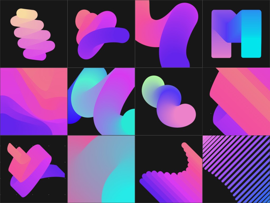
03. Liquid/Fluid Gradients & Animated Gradients
Gradients are not new to online experiences, but often in the past gradients were static and had just two or three colors. Moving into 2024 I’m predicting we’ll see more complexity with liquid gradients, gradients combined with content, as well as gradients with 5+ colors and dynamic animations.

I’ve always loved gradients because they create an illusion of movement while enhancing a minimalist design, and adding animation can further enhance the experience, even more so by making it user-interactive to drive engagement.
However, the power of complex and animated gradients goes beyond visceral appeal – it taps into the psychology of color. As I mentioned in a previous post on Emotional Design, that “it’s critically important to focus on crafting a visceral design that makes users feel delighted and excited. You have to understand what motivates them. Understand their wants and needs. And then craft a visual experience that will tug at their heart strings, where their emotions do the deciding.”

Various colors elicit diverse emotions and associations, and by combining these hues it enables designers to establish a particular mood or communicate a message nonverbally.

I really love this gradient trend because it’s extremely versatile. It can be bold or subtle, the focal point of a design or a background element. And because you can mix and blend different shades of color, gradients can create new color combinations that feel different and modern, lending a completely unique feel to designs. I added a few free tutorials below so you can learn how to master the ability to create liquid gradients in your designs.


Create liquid gradients with Spline (Figma plugin):
https://spline.design/

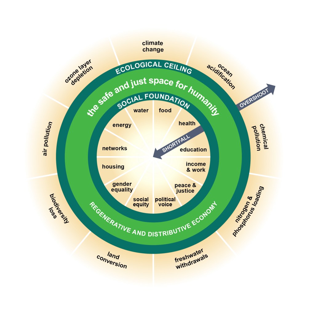
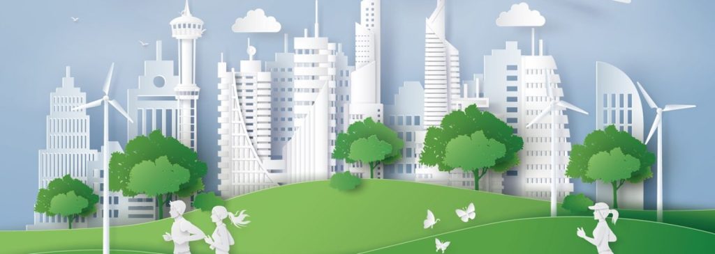
04. Sustainable Design
As designers, we wield considerable influence in advancing ecological and social sustainability, and it’s imperative that we harness this power effectively.

Sustainable UX and UI design must encompass considerations for both environmental and societal aspects. It requires us designers to be thoughtful in minimizing adverse effects on our environment and communities while maximizing positive contributions to both.
One great method to dig deeper is with the donut diagram, which represents social foundations in its inner circle and ecological boundaries on its outer rim.
Minimizing the negative impact of UI/UX
UX Design: To reduce our CO² and energy impact of UX, we can help by using less images, less videos, turning off auto-play videos, less interactions, and less other data-heavy components. I recommend utilizing lazy loading instead of publishing hundreds of images, or perhaps consider reducing the number of push notifications to just the critical ones, etc.
UI Design: To reduce our environmental impact of UI, we can explore innovative approaches with lightweight elements like icons, illustrations, shapes, forms, and colors. Sustainable UI practices also involve optimizing, scaling, and compressing images and videos to minimize data usage. Consistency in UI elements is essential, including considerations for the quantity and variety of fonts utilized, with preference given to preinstalled system fonts or compressed font files. Additionally, ecological UI design emphasizes the use of energy-efficient color palettes and OLED monitors.
Maximizing the positive impact of UI/UX
To maximize the positive impact of UI & UX, focus on designing for great usability, easy to understand content, intuitive short click paths, green delivery options, packaging-free variants, including CO² displays in web shops, promoting sustainable products, fuel-efficient travel routes, sustainable default options, and many more.
05. Powerful Storytelling
As designers, your digital experiences need to not only survive – but thrive – amongst the billions of apps & websites competing for your customers’ attention. To do this, it’s critically important to carefully design and build an experience that captures the heart & soul of your customers. So how do we promote effective communication that acknowledges both the speaker and the listener? How do we foster deeper connections, tapping into your customers’ emotions, ambitions, and values?
The answer is simple: storytelling
The power of storytelling is an ancient and universal force that transcends cultures and spans generations, and “is the way knowledge and understanding have been passed down for millennia” notes the famous author & speaker Simon Sinek. It’s a fundamental aspect of human communication, weaving narratives that connect individuals and communities worldwide. We can trace the origins of storytelling back thousands of years to some of the earliest forms of human communication, from prehistoric cave paintings to oral traditions.

Utilize Pixar’s 6 Rules for Creating Powerful Stories
Pixar is at the pinnacle of storytelling prowess, delighting audiences of all ages with narratives that transcend the boundaries of animation. For designers who want embrace all of Pixar’s storytelling magic, I’ll walk you through Pixar’s 6 rules for creating powerful stories so you can apply them to your work…
Rule 1: Great stories are universal
The first rule is that the most epic stories are universal, where anyone can understand it and relate to it. Think about love stories, good vs evil, the underdog, and so on.

Rule 2: Great stories have a clear structure and purpose
Story structure is a critical element to developing a succinct storyline, where Pixar has used their patented story framework to create most of the films that we know and love today:
Once upon a time, there was _____.
Every day, _____.
One day _____.
Because of that, _____.
Until finally _____.
Rule 3: Great stories have a character to root for (an underdog)
Believe it or not, people want to root for the main character.
And there’s nothing like a good underdog to hype up audiences!
Rule 4: Great stories appeal to our deepest emotions
Psychologists generally agree that there are six basic emotions: happiness, sadness, fear, disgust, anger, and surprise.

Consciously being to recognize these various emotions in yourself —and think about the “why” of your emotions.
Rule 5: Great stories are surprising and unexpected
Surprising your audience in fun and unexpected ways is a must for a great story. And not just the classic fairytale storyline where prince charming saves the princess in need. You have to challenge yourself to dig deep and challenge or change common perceptions and stereotypes.
Rule 6: Great stories are simple and focused
We the viewers know a good story when we see or hear one. As storytellers, you’ll often find yourself adding more and more layers that don’t need to be there. Because as I mentioned in my post on why designing simple experiences is psychologically impossible, humans love complexity. This is called complexity bias, where our brains actually reward complexity.
06. Ethical and Privacy-focused Design Practices
2024 will bring a significant shift towards transparency and user empowerment due to the growing awareness and concerns around data privacy and ethical design. This includes clear data usage policies, easy-to-navigate privacy settings, and designs that encourage informed consent practices.
We designers have a moral and ethical obligation to be good stewards of our design expertise in crafting experiences that will not only resonate with our customers, but will also respect and prioritize their health & security online. Design for them as you would design for yourself. This includes safeguarding their data, rights, and privacy in both the physical world as well as the online world.
Our design choices influence how user data is collected, processed, and utilized, where we should be knowledgeable around the ethical considerations and desired outcomes. This requires us to be thoughtful about the implication of every color, button placement, and interaction has beyond the visual realm.
This may require us to push back on the leadership to “speed up the process to hit this deadline,” or a more balanced approach in working with our business partners who want to squeeze every penny out of our customers.
Take the time and space to be transparent with your customers because it’s the foundation of ethical design.
Clearly communicate to users how their data will be collected, used, and stored. This builds trust and empowers users to make informed choices.
07. Zero UI
I’ve explored various aspects of this trend in the past, where it continues to gain steam around the concept of an ideal interface, well, having no interface at all. Whenever we use new mobile apps, there’s a certain learning curve that takes time to become familiar with the technology. By contrast, Zero UI has no interface and therefore no learning curve.
We simply use our humanness to interact with an application via our voices, gestures, facial expressions, and touching. No instructions required!
As ambient computing and IoT devices become more pervasive, designers may explore Zero UI experiences where interactions occur seamlessly in the background without explicit user input, relying on contextual cues and automation to anticipate and fulfill user needs.

Siri voice assistant, virtual reality glasses, Face ID, smart speakers, fitness trackers, and smart home systems are all harbingers of a new era — the era of devices with zero interfaces, Zero UI.
08. WebGL + 3D + Motion Effects
The integration of 3D elements within UI design is experiencing rapid growth, fundamentally altering the user experience across digital platforms. This growth is largely due to WebGL, which is a JavaScript API that uses in-browser HTML5 to draw 2D and 3D graphics. It’s a subsidiary of OpenGL and does not rely on any external plugins.

These experiences will drive high engagement and build relationships with your customers, while helping to increase conversion. Some example include 3D objects, illustrations, transitions/animations, and interactive 3D objects, creating visually engaging and immersive user experiences.

I anticipate we’ll see this expansion beyond crypto and ecommerce domains in 2024, extending into educational applications, virtual event platforms, and even commonplace tools such as calendars and fitness applications.
The depth and authenticity afforded by 3D designs foster an immersive sensation that amplifies user interaction, rendering routine activities more pleasurable and intricate tasks more intuitive.

Furthermore, this trend is fueling advancements in augmented reality (AR) and virtual reality (VR) environments, where 3D elements serve as pivotal conduits, bridging the gap between virtual and physical realms.

09. Algorithmic grids
Algorithmic grids are part of the trends that we will see in 2024, where you can divide a long read into several logical areas with an invisible grid to help control the viewer’s attention. These grids have evolved into intelligent frameworks that guide the user’s eye through content seamlessly and intuitively.
There are 7 basic algorithmic grids that you can use to design web pages. The ‘ladder’ grid supports the diagonal eye movement of the viewer’s eyes, while the ‘comb’ grid features higher vertical blocks that offer a unique visual rhythm to the layout. These grids are not just about structure; they are about guiding user engagement subtly yet effectively.

The challenge is that there are no strict rules about how many areas you should create, where you regard the long read as a chain of blocks with equal importance. I recommend the use of spacing, size variations, and color contrasts to prevent user confusion while ensuring a smooth and engaging journey through the content.
10. Non-Standard & Asymmetrical Layouts
I admit this trend can sometimes give you hipster vibes, where they’re obviously trying to hard to stand out from the crowd. Just seeing zig-zag alignment included vertical, horizontal, or even stair-step structures can be overpowering and hard to follow. And certainly this approach might not work for large content companies or creators, but it’s honestly great at creating more niche memorable online experiences.

By departing from conventional symmetrical boxy layouts, asymmetrical design introduces an element of imbalance. This approach frequently embodies modernism, characterized by its inventive utilization of space and color. Successfully implementing asymmetry hinges on the ability to harmoniously combine contrasting elements to create visually compelling compositions. Here’s a few tips I recommend to guide you in this process:
- Add focal points. Focal points are the areas within a design that capture the viewer’s gaze. You can create focal points by varying the color, texture, and size of different asymmetrical elements within your design. Adding these types of striking features to your design can differentiate the foreground and background for the viewer.
- Create visual balance. Although asymmetrical layouts strive to create irregular and disproportionate outlines, they still emphasize balance. With a balanced design, the visual weight of the varying colors, objects, and textures is stable, allowing the viewer’s eye to take in the space without feeling overwhelmed. You can create balance by playing with color, counteracting a large object with blank space, changing typography, or expressing movement in the design. Consider also using a grid to determine whether your have a balanced digital design.
- Integrate contrasting colors. Another aspect of asymmetrical balance is using contrasting colors to guide the viewer’s attention. Contrasting colors are colors positioned on opposite sides of the color wheel. Examples of these color pairings include red and green, blue and orange, and purple and yellow. In your asymmetrical design, incorporate light and dark colors to highlight certain areas of your design.
- Use movement and white space. Incorporating movement into your design is another way to guide the human eye to a central point. For example, if you’re designing a homepage for a website, consider using movement in your design to influence user attention, encouraging visitors to click on additional links and pages. Playing with white space can also help structure the movement in your graphic or website design. Rather than using the traditional grid system for your UI design, incorporate negative space into your web pages to send users to key points. Balancing your design with white space is also a great way to improve the user experience, as it prevents site visitors from getting overwhelmed by extra links, boxes, and web pages.
Conclusion
As we step into 2024, the UI/UX design trends we’ve explored signal a transformative era in digital interaction. These trends go beyond aesthetic appeal, focusing on creating empathetic, inclusive, and ethically responsible digital experiences. They aim to make technology more intuitive, personalized, and aligned with the user’s well-being.
The future of UI/UX is set to redefine our digital interactions, making them more human-centric and environmentally conscious. As designers continue to innovate, users can anticipate a more connected and engaging digital world that respects privacy and caters to diverse needs. In short, 2024 is poised to be a landmark year where design meets human touch, reimagining our interaction with technology in profound and meaningful ways.
I’d love to get your feedback on this post as well as any new trends in UX/UI design you’re predicting we’ll see this year. And don’t forget to go back and revisit my design trends of the past: 2023, 2022, 2021, 2020, 2019
One thought on “The Most Popular Experience Design Trends of 2024”