
In 2026, I’m predicting that designing for intent, Machine Experience (MX) design, designing better prompts, and AI generated Design Systems will become the foundation of AI hyper-personalized user experiences.
I also predict that Multimodal Experiences will revolutionize the way we engage technology, and we’ll continue to elevate our designs with the return of glassmorphism, emotionally aware modes, and a pop of nostalgia. And unfortunately I predict that AI will force our Design orgs to take a giant step backwards in our Design Maturity this year, but I’ll help you avoid it.
Happy new year, grab your popcorn and enjoy my design trend recommendations for 2026!
Design Trend #1: Multimodal Experiences
I find it strange that even though we live in a world of endless screens and connected devices, our experiences still assume a single user, on a single screen, at a single moment.

That’s why I predict that will all change in 2026 as we leap into the new adventure of multimodal experience design.
One of my core design beliefs has always been that technology should adapt to humans, not the other way around.
And today that matters more than ever, because we’re no longer just sitting and clicking on a computer. We’re talking to our devices, swiping and gesturing, watching, sometimes even using our eyes or our movement to interact.
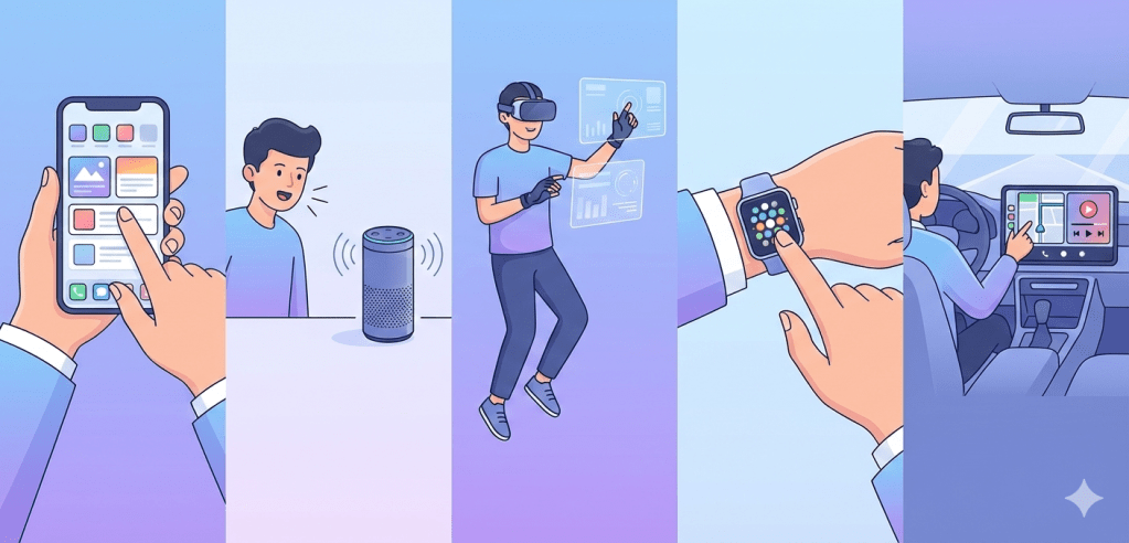
We’re also not staying in one place anymore. Everyone is constantly moving, switching between phones, laptops, cars, watches, TVs, and whatever comes next. This means experiences can’t be a single mode.
They have to flex with context, device, and personal preference. We have to design for multiple human inputs and outputs, not just touch and sight.
It’s about creating experiences that flow naturally across modes, the way humans already do.
Multimodal experiences brings all of this together:
- 🗣️ Voice (speech, tone, intent)
- 👀 Vision (gesture, gaze, camera)
- ✋ Touch & haptics (vibration, force)
- 🧠 Context & sensors (location, movement, environment)
- 🖥️ Screens (still relevant, but they’re no longer the focal point)
Evolution of Design and Technology
When I look at where product design is headed, it feels like we’re moving from designing interfaces to designing full experiences. We’re shifting from:
- Visual-first to experience-first
- Screens to systems
- Control of technology to collaboration between humans and machines
Design isn’t just about where someone clicks anymore. It’s about how an experience flows through their day and adapts to their context, whether they’re on a phone, in a car, talking to a device, or switching between all three.
I see that shift also dramatically changing the role of designers too.
In multimodal systems, I’m no longer just thinking about layouts, flows, and screens. I’m designing conversations, transitions between modes, what happens when voice fails and touch takes over, and how to build trust even when there’s no visual UI at all.

It’s why modern UX/CX is starting to blend with conversation design, interaction and motion, behavioral psychology, and even prompt and intent design.
Example: Google Maps Multimodal Experience
You may not have even noticed the change over the past few years, but Google Maps has been one of the first products to quietly evolve into a multimodal product.
- Visual routes when you’re planning
- Voice guidance when driving
- Haptic taps on smartwatches for turns
- Predictive suggestions before you ask

Same product. Different modes. One seamless experience.
Lesson: Multimodal UX/CX isn’t about adding features, it’s about switching seamlessly.
Key Principles for Designing Multimodal Experiences
1. Don’t Make All Modes Equal
Not every task needs every mode. The system must recognize when to switch or combine input modes based on environment or task.
Bad multimodal UX/CX: “You can tap, talk, gesture, swipe… all at once.”
Good multimodal UX/CX: “We chose the best mode for this moment.”
2. Design for Seamless Mode Switching
Creating experiences with seamless mode switching means that your users shouldn’t notice when modes change. They should easily predict how their inputs affect the system, regardless of mode.
Example:
- Start with voice → glance at screen → finish with a tap
No resets. No friction.
3. Always Design a Fallback
Voice fails in noisy places.
Gestures fail in low light.
Screens fail when hands are busy.
Multimodal Experiences are delightful when another mode steps into save the experience. Systems should gracefully handle misheard commands or ambiguous gestures.
4. Feedback Is Critical
Provide clear, mode-appropriate cues to help users understand what’s happening. Because without screens, feedback must be:
- Audible
- Haptic
- Temporal (timing-based)
A vibration, a tone, or a micro-pause can replace an entire UI screen.
5. Personalization
Allow users to customize preferred input modes or combinations.
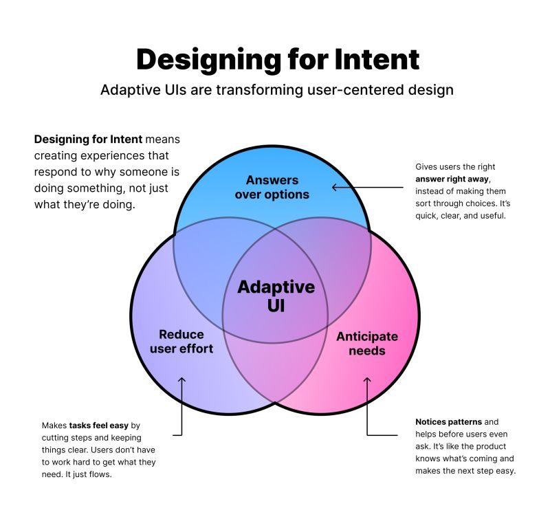
Design Trend #2: Designing for Intent
Designers in 2026 will no longer create fixed interfaces.
I believe we’ll see a major transformation in the world of product development, where we start to design products for intent.
No more funnels. No more customer journeys. Now we’ll need to design for each user’s specific intent! Sounds crazy, right?
What is Designing for Intent?
This means creating experiences that recognize, respect, and respond to what a user is actually trying to accomplish. And not what your product wants them to do, not what features exist, and not what the system assumes.
It’s an extraordinary shift from designing interfaces to designing outcomes.
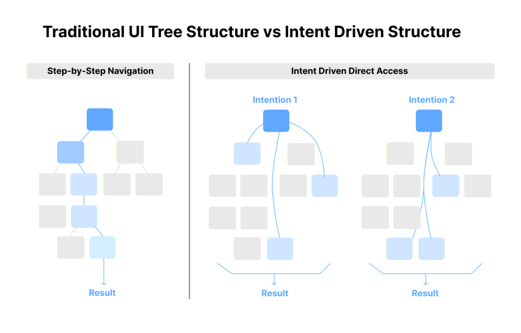
Generative systems do not follow pre-built screens. They follow patterns, predictions, and signals. This means that instead of designing for every step of a funnel, we are designing the conditions a system uses to decide what to show, what to emphasize, and how to adapt.
To design for context, we need to:
- Understand user habits and timing
- Map intentions, not just actions
- Consider edge cases where the AI might get it wrong
- Define how the system fails gracefully without frustrating users
How Do We Understand Each User’s Intent?
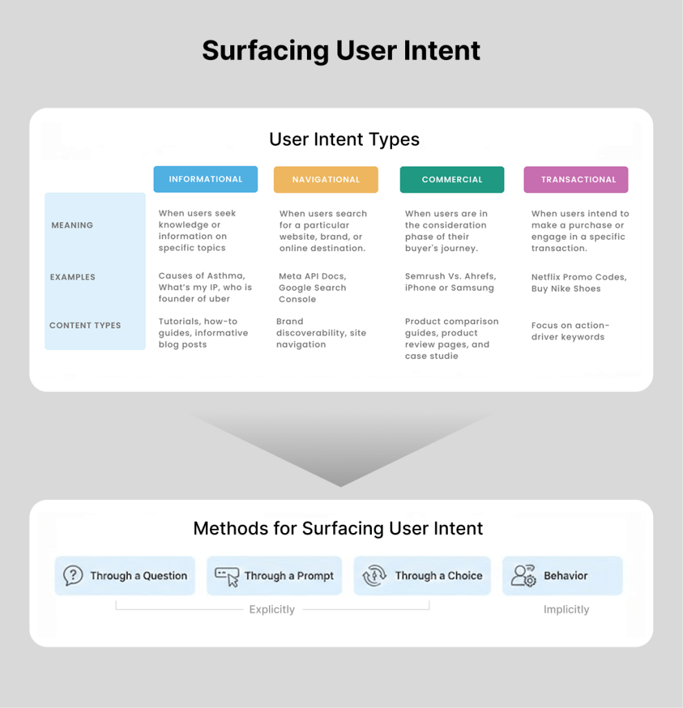
In generative experiences, there’s 4 primary types of user intent:
- Informational – When users seek knowledge or information on specific topics
- Navigational – When users search for a specific website, brand, or online destination
- Commercial – When users are in the consideration phase of their buyer’s journey
- Transactional – When users intend to make a purchase or engage in a specific transaction
A user’s intent can surface explicitly through a question, a prompt, or a choice, or implicitly through behavior. Google’s PAIR guidebook talks about this distinction between explicit intent and intent inferred from behavior, which forms the basis for how AI predicts what comes next.
Once the system understands the user’s intent, it predicts what the user needs next. That prediction determines what gets generated, whether that is a layout, a set of recommendations, content variations, or the next step in a flow.
The most exciting thing to me is that every user will potentially see something different based on their intent!

How Designers Can Optimize Generative Experiences
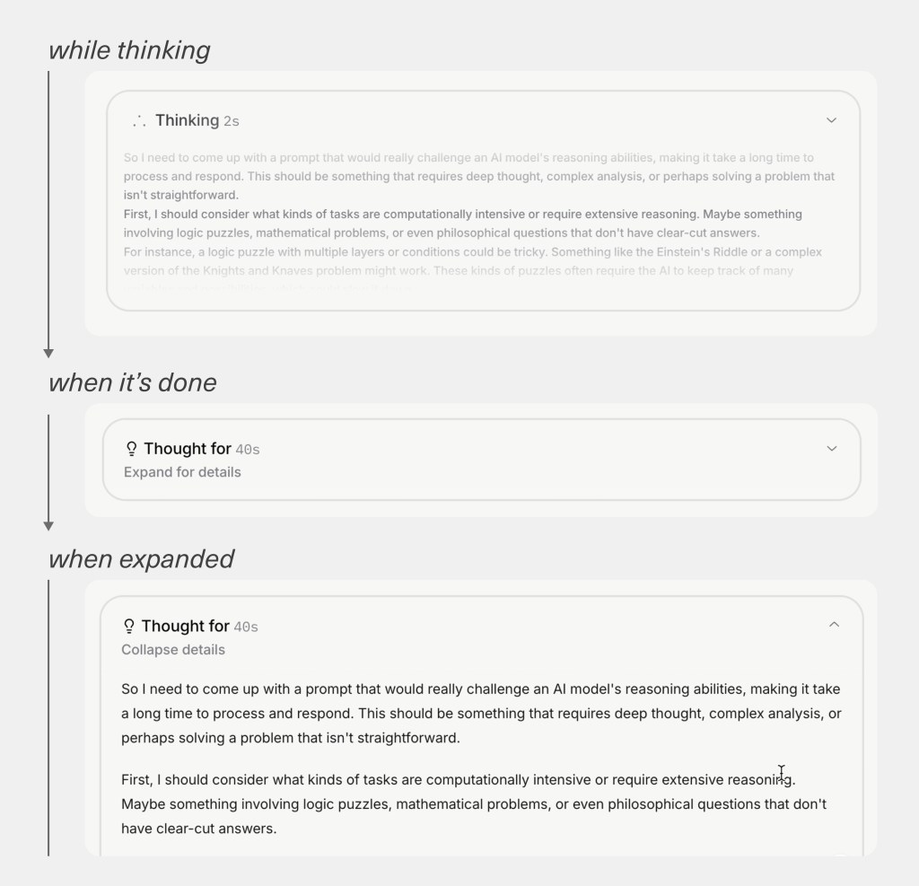
With AI, there’s no guarantee the system gets it right every time, so we need a way to tell when it actually worked.
That’s why I always make the system’s reasoning visible – similar to Grok’s reasoning example below – and tie everything back to clear goals and signals by defining what “good” looks like in the real world.
Designers should no longer judge success by how a screen looks compared to the old one, but by how users behave. If they move forward, stay engaged, and accomplish what they came for, the system made the right call. If they hesitate, ignore it, or bail, it didn’t.
It’s less about pixels now and more about whether the experience genuinely helped someone get where they wanted to go.
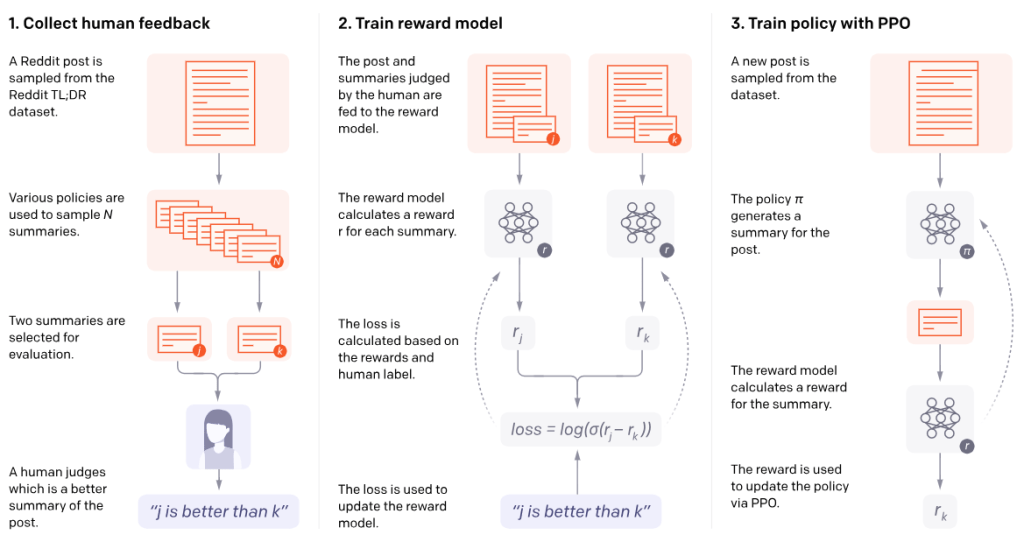
OpenAI describes a similar idea in their work on learning from human feedback, where systems compare predicted outcomes to desired ones.
This gives designers two places to focus optimization efforts. We can refine the experience that was generated, or we can refine how the system infers intent.
Sometimes this means improving interface patterns. Sometimes it means strengthening the signals we collect. Sometimes it means giving users clearer ways to express what they want.
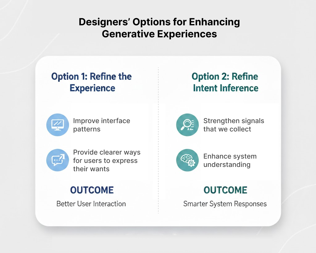
Either way, the work becomes the same. We check the signals produced by a generative interface against the expected signals tied to our goals and success metrics, and we use that comparison to guide how the system adapts.
This is how designers contribute to AI-driven experiences. We are not only designing what users see. We are designing the understanding the system relies on to generate it. This requires designers to shift our focus from:
- Features to flows of understanding
- Layout to logic
- Aesthetics to intent
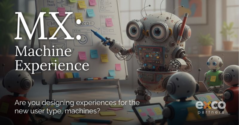
Design Trend #3: Machine Experience (MX) Design for Generative AI
The previous trend of designing for intent sets up this next trend, which requires us to dive below the surface of design and focus on the Machine Experience (MX) design.
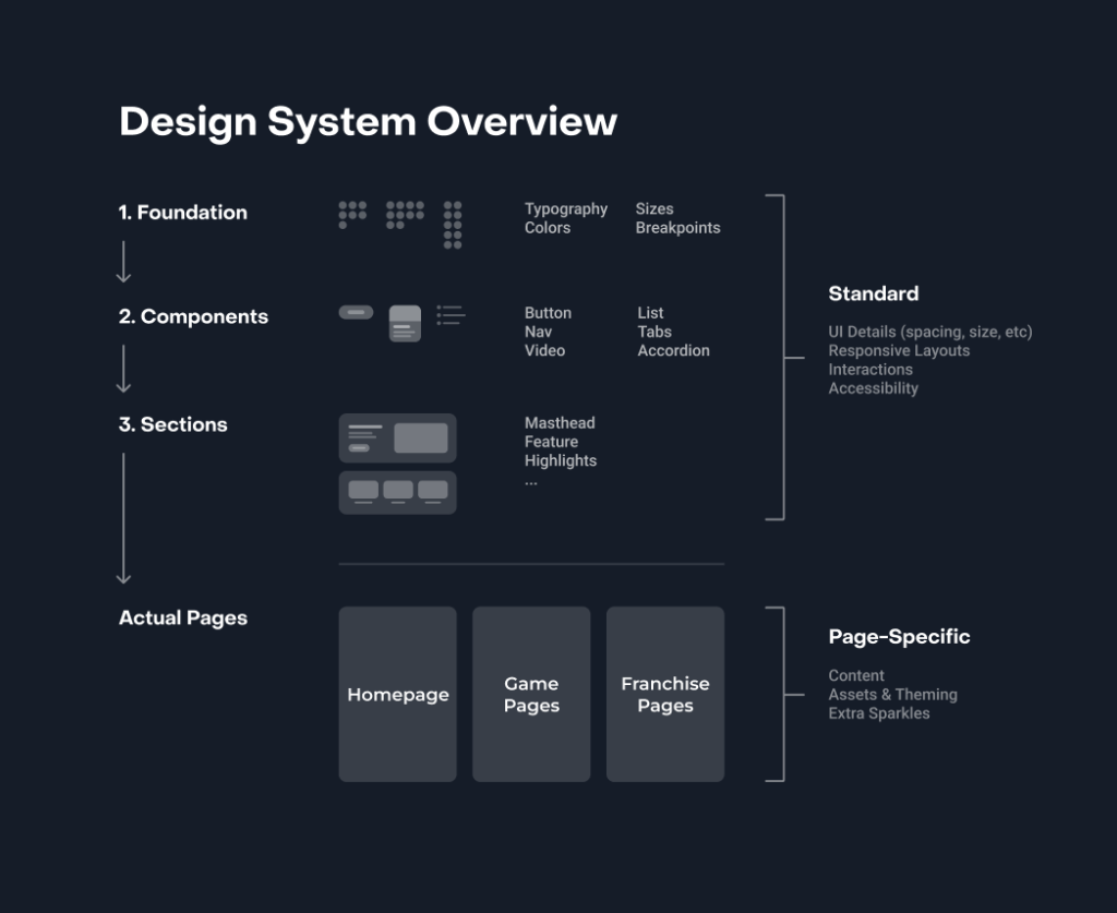
Generative systems cannot rely on signals alone. They also need to understand our components, patterns, and design systems in deeper, more semantic ways.
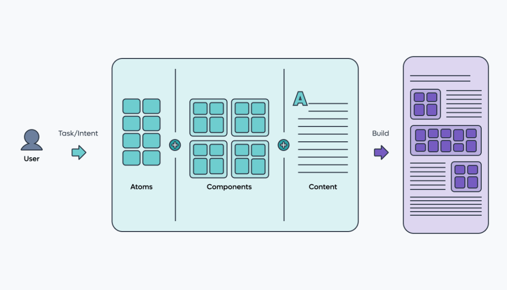
Figma has written about this shift in their guidance on semantic design systems, emphasizing that AI needs component meaning, not just component visuals, to generate interfaces responsibly. To help with this effort, I recommend using a semantic design system that involves embedding intent and logic into every component:
- Component Documentation: Use descriptions and metadata within design tools (like Figma) to explain why a component exists and when it should be used, rather than just how it looks.
- Semantic Tokens: Use design tokens that describe a role (e.g.
button-primary-background) rather than a literal value (e.g.,blue-500), allowing the machine to understand the intent of the color. - Relationship Mapping: Clearly define the relationships between components. For example, explicitly link a form label to its input field so an AI agent can correctly interpret the data requested.
This subtle shift towards MX means you’re no longer designing your site just for people. You’re designing it for the machines that now read, interpret, and summarize your content long before actual users interact with the page.
This shift is happening because user behavior isn’t what it used to be.
Your potential customers are asking ChatGPT, Gemini, and Perplexity to “find the best,” “compare options,” or “explain the difference.” And these agents build answers by interpreting your website at a structural level.
Meaning, hierarchy, relationships, labeling, and semantic HTML cues suddenly matter as much as layout and visual design. Mike Simpson developed research where he breaks down how AI systems actually navigate a website.
He found that these systems rely on semantic HTML, clear heading hierarchy, predictable patterns, and consistent labeling to infer relevance and meaning. When those signals are messy, LLMs misread your content or leave it out entirely.
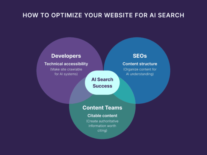
So MX isn’t some niche technical layer, it’s the new cost of visibility. The key benefits include improved discoverability in AI search results and accurate representation of your content.
It forces you to think beyond how your product looks and ask a new question: Can machines understand it well enough to represent it accurately?
If not, you’re invisible in the new AI-mediated web.
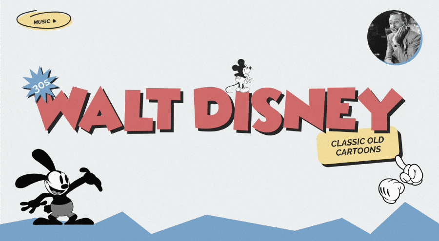
Design Trend #4: Sparking Joy with Nostalgia
I keep noticing how much nostalgia is popping up, well pretty much everywhere! It tugs at my heartstrings when it’s used well, so I’m hoping 2026 is when it fully becomes intentional instead of trendy.

Nostalgia works well when it’s not just using retro for the sake of aesthetics. It’s designers deliberately pulling from familiar patterns, sounds, and interactions to make products feel emotionally safe in an increasingly chaotic world.
When everything is changing fast because of AI, economic pressure, and endless new tools, familiarity becomes a feature.
Just look at the success of the Stranger Things series.

People didn’t just love the story. They loved the brands, packaging, and design language of the ’80s that showed up everywhere, from Eggo waffles to arcade machines and mall storefronts.
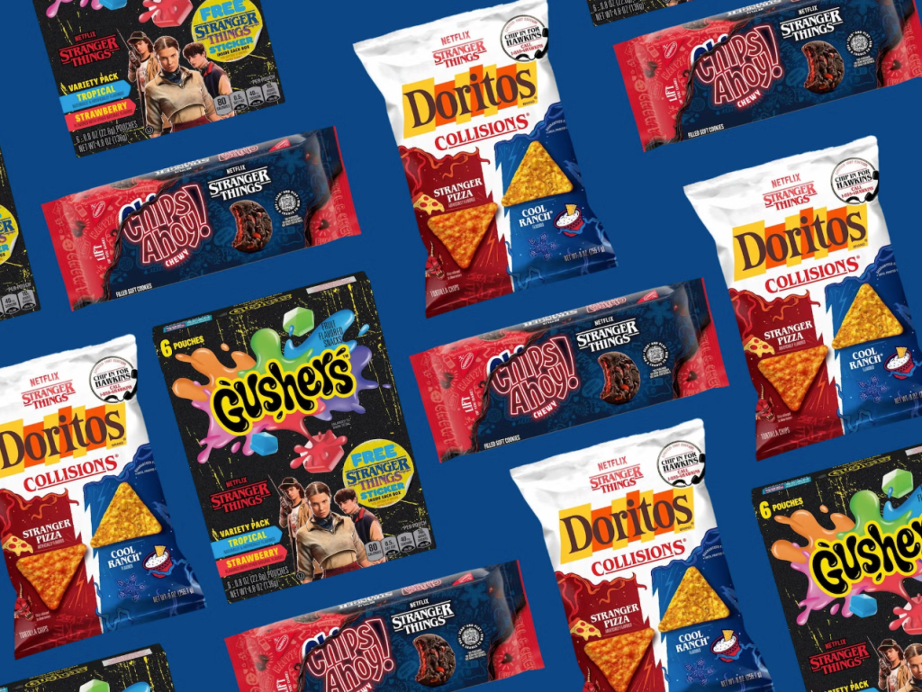
I found that these visuals set off deep emotions of comfort, curiosity, and emotional attachment for me, and even for lots of other people who never lived in that era. That same emotional response is exactly what designers are chasing.
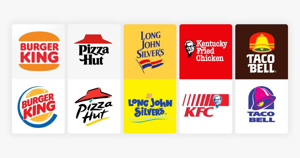
There’s plenty of other great examples I’ve seen, especially in fast food. Burger King, Pepsi, Pizza Hut, and countless others brought back their old logos. And I love everything about it.
Beyond branding, nostalgia will be utilized in product design through UI patterns that feel familiar, typography that echoes early software or the early web, playful skeuomorphic cues making a quiet comeback, and micro-interactions that feel tactile instead of abstract.
It’s less about copying the past and more about borrowing its emotional clarity. Back then, interfaces were simpler, intentions were clearer, and users didn’t feel like every click was being optimized to death.
Designing for nostalgia is really about establishing a deep emotional connection with your users.
When something feels familiar, people relax. They explore more. They forgive more. In 2026, nostalgia becomes a deliberate design tool – not just a gimmick – helping modern products feel human, warm, and reassuring in a world that desperately needs it.
Design Trend #5: Return of Glassmorphism
Speaking of nostalgia, Glassmorphism is back baby!
It feels like it’s returned from college, this time a little more mature.
I remember when it was once dismissed as a flashy visual trend, but now glass has re-entered the design conversation with a clearer purpose, borrowing lessons from skeuomorphism’s obsession with realism and neumorphism’s subtle depth experiments.

I think the 2026 version feels less like an aesthetic trend and more like a functional design layer you can finally use without fighting your tools. It’s actually easier to implement things like frosted panels, translucent surfaces, diffused shadows, and layered depth.
Apple is Leading the Way
Apple is leading the charge with glassmorphism. With Liquid Glass, they’ve turned glassmorphism into a dynamic and visually appealing system rather than a static style.
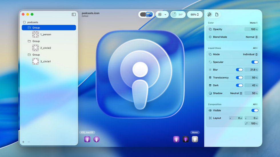
All thanks to emerging technologies like modern blur APIs, standardized system styles, and better cross-device performance.
I think the new version of glassmorphism is mostly about controlling opacity, background blur radius, and elevation. You’re deciding how much of the environment bleeds through and how quickly it diffuses.
For Apple, their genius lies in their recognition that the future of computing is spatial. With Vision Pro already in the market and Apple Glass rumored to be in development, the Liquid Glass UI serves as a bridge between our current flat interfaces and the immersive, layered experiences of augmented reality.
I believe it’s very strategic that they’re training users to interact with floating, translucent elements now, because Apple is preparing us for a world where digital objects exist in three-dimensional space.

Accessibility Issues with Glassmorphism
However, I agree with the critics there’s definitely some serious accessibility concerns with resurrecting this style. The most common issues are inconsistent readability, where text becomes too light, too dark, or completely washed out. And if your background image is busy it will only make it worse.
I’m cringing just looking at those ugly screenshots below, yikes!
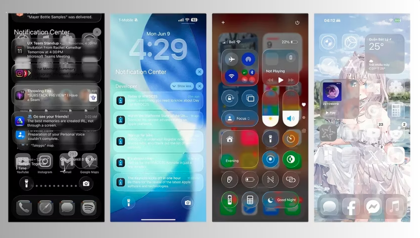
Thankfully it’s completely customizable, so you can quickly fix these issues. But I’d recommend Apple to quickly build in a feature that analyzes accessibility based on a user’s settings and provides recommendations to improve it.
So if you’re leaning into glassmorphism this year, here’s a few recommendations:
- Maintain high contrast for text and essential features to ensure it maintains a WCAG-safe contrast ratio
- Implement an opacity slider or transparency options in your product so it’s easy to reduce or disable glass effects based on user preferences.
- Test against real backgrounds, in motion, across light and dark modes
Design Trend #6: AI Generated Design Systems
I’m predicting in 2026 that we’ll see Design Systems created with AI.
I have a love/hate relationship with Design Systems. Mainly because I feel like they steal valuable time away from designers in the actual design of thoughtful experiences that solve customers’ problems.
However, once they’re built they certainly provide an efficiency boost for designers by saving time, reducing repetitive tasks, and helping teams deliver consistent, high-quality user experiences. A well-structured system allows designers and developers to work faster, avoid starting from scratch, and focus on meaningful problems.
So AI generated Design Systems feel inevitable, and perhaps a little unsettling.
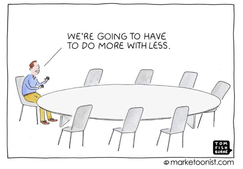
On the surface I like the idea where you feed AI your brand, a few constraints, and boom — a full design system with components, tokens, and patterns magically appears. Speed like that is hard to ignore, especially in a world where teams are constantly being asked to do more with less.
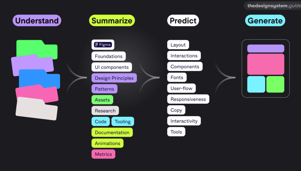
But here’s the thing. Design Systems aren’t just libraries of components. They’re a record of decisions. They encode taste, tradeoffs, and hard-won context about users, technology, and the business. When AI generates a system instantly, it skips the conversations that usually make a system actually useful.
You get consistency without conviction.
I’ve already seen teams treat AI-generated systems as shortcuts, dropping them into products without asking why certain patterns exist or when they should be broken. The result looks polished, but it’s brittle. The system works right up until the moment something unusual happens, which is most real products.
That said, I don’t think AI-created design systems are bad. I think they’re powerful starting points. Used well, they can accelerate groundwork and free teams to focus on higher-level problems. Used poorly, they replace thinking with output.
The real question isn’t whether AI can create design systems – it’s whether teams are mature enough to take ownership of what the AI produces.
Experimenting with Motiff AI Tool
Among all the tools available, Motiff stands out. While many hoped Figma would lead the AI revolution in design systems, Motiff took the first step. It focuses on three major areas: system creation, system maintenance, and consistency checks.
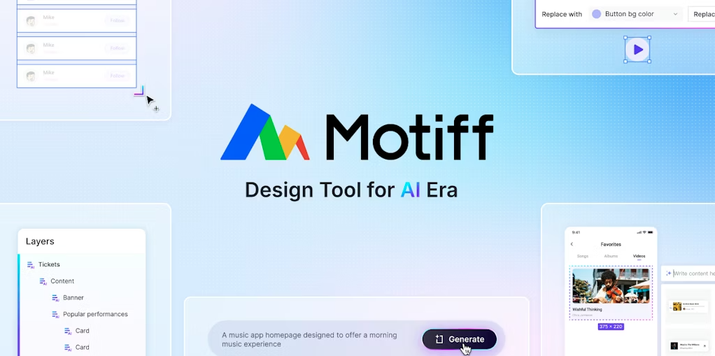
When I used Motiff, I uploaded raw design files like basic UI screens. Motiff scanned the files and extracted every reusable element: colors, icons, badges, popups, tabs, and more. It gave me a full visual inventory of the design without any components having been built.
It even told me how many times a certain element was used and showed me where it appeared. For someone who often audits large files created by multiple designers, this was a game changer. It did not create the components for me, but it gave me clarity, speed, and control. I could decide what to include and how to build.
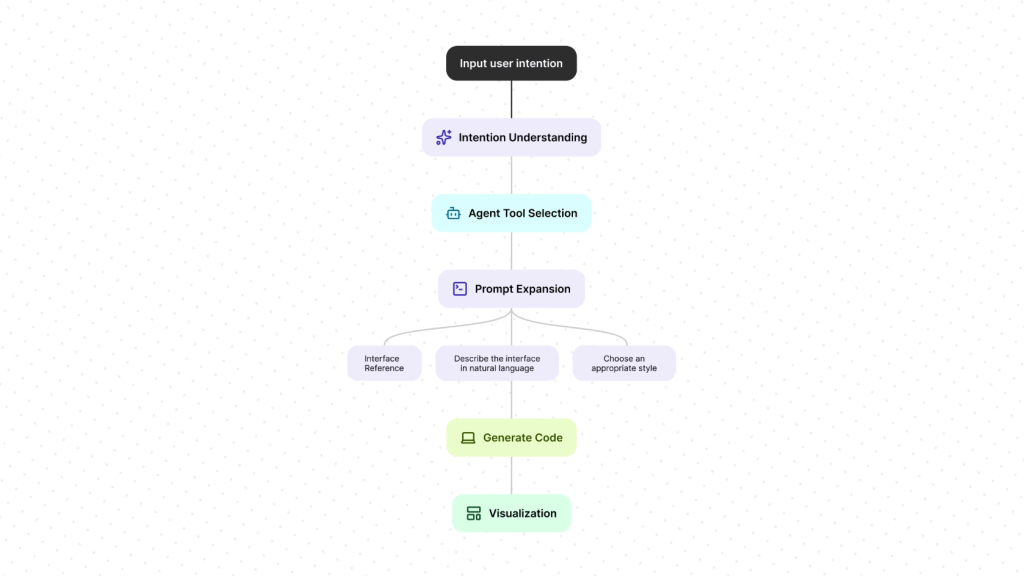
Motiff also offers a consistency checker. Once a design system is in place, it helps ensure that every screen uses the right components and styles. It highlights mismatches and suggests how to fix them. If needed, it can replace outdated styles across the file instantly.
Looking ahead, I believe there is so much more AI can do in this space:
- Smart suggestions for components based on usage patterns
- Pattern detection across live product files
- Usage analytics for patterns and components
- Syncing design tokens across platforms
- Governance bots that flag inconsistencies and outdated documents
- Summarizing team conversations into action items for design system tasks
- Accessibility validation based on country-specific compliance laws
These ideas are not far off. Many are already being explored in labs and prototypes.
Design Trend #7: Emotionally Aware Modes
I love this next prediction for 2026 where we design for our users’ emotions!
This one is personal for me, because I’ve believed for a long time that the future of great products isn’t just making them smarter.
It’s about making them emotional.

Quick Intro to Emotional Design
A few years ago I wrote about why emotional design is what separates products people use from products people actually love. I talked about how the most successful experiences don’t just solve functional problems, they connect with us on a human level. How they make us feel understood, calm, confident, energized, or inspired.
This builds off of Don Norman’s book on Emotional Design, where he broke down how we experience products on three levels:
- Visceral: how it looks and feels at first glance
- Behavioral: how well it works and supports us
- Reflective: what it means to us and how it makes us feel about ourselves

What’s fascinating is that these three emotional layers map almost perfectly to where interfaces are heading. I believe products will start triggering all three intentionally this year. Not just through visual polish, but through systems that adapt to how we feel, what we’re doing, and the rhythm of our day.

We already live in constantly shifting contexts: deep work, casual scrolling, late-night exhaustion, early-morning ambition. So I keep asking myself:
- Why should an interface feel the same in the morning as it does at night?
- Why should it behave the same when I’m stressed versus energized?
- Why should it look the same when I’m trying to focus versus unwind?
- Why should it look the same for every season of the year?
Emotionally aware modes are the natural evolution of human-centered design. They’re about building interfaces that respond to internal context, not just external ones.
What Exactly Is Designing for Emotions?
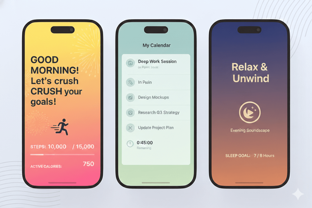
Designing for emotions is where experiences don’t just adapt to screen size or environment, but to you and your mood, your energy level, what you’re doing, and even the time of day.
And honestly, I think it makes total sense.
Our lives are a constant blend of work, focus, stress, downtime, creativity, and rest.

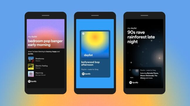
Think of it as the UI version of Spotify’s mood playlists. The experience subtly changes its vibe to match your state visually, behaviorally, and even psychologically.
- Morning Mode (Visceral): light palettes, energetic motion, optimistic typography
- Focus Mode (Behavioral): low contrast, minimal animation, calm rhythm
- Evening Mode (Visceral + Behavioral): warmer tones, slower transitions, reduced cognitive load
- Reflective Modes: themes that reinforce identity like creative, calm, playful, professional
It’s personalization at an emotional level as the interface mirrors how you feel or how you want to feel.
Why This Matters
Norman argued that emotion directly affects cognition, problem solving, and trust. When people feel calm, confident, or delighted, they literally think better. That means emotionally aware interfaces don’t just look nicer, they actually work better by:
- Reducing cognitive fatigue
- Increasing long-term engagement
- Building trust and attachment
- Making products feel like companions, not tools

How Designers Can Bring This to Life
Designing for emotion in 2026 means:
- Starting with emotional intent, not visual style
- Designing systems of feeling, not just screens
- Treating color, motion, copy, sound, and pacing as emotional instruments
- Giving users control, not just automation
- Being transparent and ethical about emotional sensing
I truly believe we’re moving from reactive interfaces to empathetic ones. From products that respond to clicks… to products that quietly understand how we’re feeling. And when we finally design across the visceral, behavioral, and reflective layers together, experiences won’t just be usable or beautiful.
They’ll finally feel human.
Design Trend #8: Designing Better Prompts
I’ll admit it, AI keeps me up at night.
Not because AI is going to replace me, but because of all the hot garbage AI is producing while destroying good design in the process.
It’s like OpenAI and all the other LLMs completely ignored design when creating ChatGPT. Clearly these interfaces were created by engineers and designed to produce high volumes of poop.

Especially when it comes to anything visual like graphics, wireframes, UI’s, etc. These LLMs aren’t smart enough to understand the visual language.
What these LLMs are very good at doing is shortcutting good thinking. Which in turn produces lots of generic outputs. And somehow everyone has jumped aboard the mediocrity train in the process. So where’s the humanity? And where the hell is design?
Because this is where us designers shine.
We’re experts at turning complex needs into coherent, usable systems. And the thing that AI needs most is what design brings to the table: empathy, clarity, and the ability to shape the human experience into cohesive beautiful products that customers love.
Until these LLMs improve the experience to help users create better outputs, then in the short term it’s up to us designers to help optimize prompts with good design.
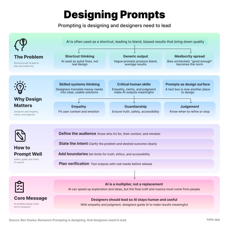
Here’s my thoughts on the prompt design checklist you need to help optimize your outputs:
1. Who is it for? (Empathy)
- Who’s the audience, and what do they already know?
- What emotional state are they likely in? (Curious, anxious, rushed?)
- How should the AI “sound” to match that?
2. What’s the intent? (Strategic Judgment)
- What problem are we solving, and is text the best way?
- What’s the specific outcome we want from this output?
- Do we need one answer or multiple options to compare?
3. What are the boundaries? (Guardianship of Consequence)
- Are there facts that must be correct and sources that must be cited?
- Any legal, ethical, or accessibility constraints to bake in?
- What should the AI explicitly avoid doing?
4. How will you verify?
- What steps will you take to check the output against real user needs?
- Who else should review it before it goes live?
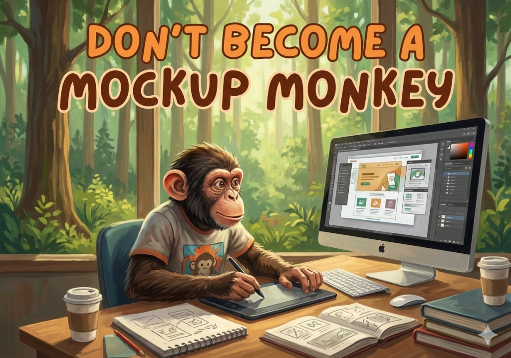
Design Trend #9: Design Maturity Takes a Step Backwards
This last one is a bit painful for me, but if you were awake for trend #8 then it’s no surprise that I’m predicting we’ll see design maturity weaken in 2026 in most large organizations. Ouch.
Not because designers are somehow less talented or ambitious, but because AI introduces a level of speed and ambiguity that most organizations are structurally unprepared to absorb.

Design Orgs are rushing to “use AI” without first redefining the design process, quality bars, or decision ownership. As a result, I’ve seen output dramatically increase while being thoughtful becomes less important, reducing outcomes along the way.
It’s as if everyone is sprinting as fast as they can in the wrong direction! The result is a quiet erosion of design maturity, pushing designers back into the role of fast-producing mockup monkeys instead of strategic problem solvers.
What is Design Maturity?
For context, Design Maturity is really two interconnected pillars:
- The level of Design Thinking knowledge and skill across every employee – not just designers, but PMs, engineers, marketers, and executives.
- How well Design Thinking is integrated into the core ways the organization operates, makes decisions, and builds products.
You can have brilliant designers who live and breathe empathy, iteration, and prototyping, but if design is still siloed and treated like a final coat of paint, maturity stays low. The opposite is just as true: you can have design perfectly embedded in every process, but if the team lacks real depth in Design Thinking, you’re just going through the motions.

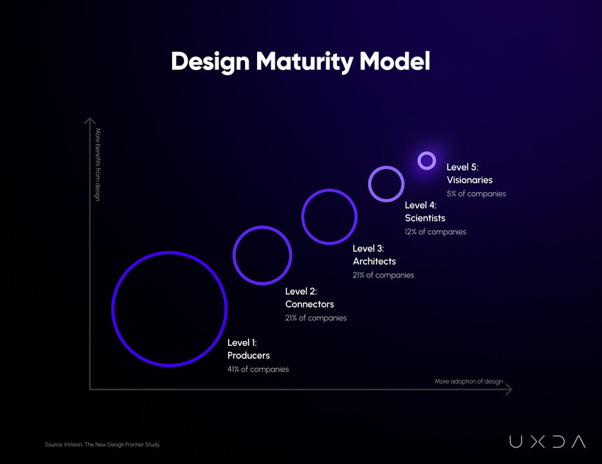
There’s a few different Design Maturity models – I prefer to use InVision’s 5 Levels model because it’s simple and backed by research.
They surveyed over 2,200 companies worldwide and published their findings in The New Design Frontier, a comprehensive report examining design’s impact on business outcomes.
Design maturity encompasses the processes, tools, and methodologies used to create products, services, and experiences that meet customer needs and drive business success. Achieving a high level of design maturity is crucial for companies seeking to differentiate themselves in a competitive market and deliver exceptional user experiences.
The concept of design maturity is built around the idea that organizations progress through various stages as they develop their design capabilities.
As a design leader, I’ve always built design maturity into my yearly strategies and goals for my Design orgs and teams. However, I’ve been shocked to see that most design leaders haven’t even heard of “design maturity” let alone how to mature their Design orgs.
Understanding these stages and the characteristics that define them is essential for businesses looking to improve their design practices and reap the benefits of a mature design organization.
Why Design Maturity Is Going Backwards
The challenge with introducing a revolutionary new technology like AI, is that it collapses the time between idea and artifact, which feels like progress.
But when everything can be generated instantly, teams skip over the foundational parts of the design process – framing, research, and exploration – which are the very practices that define mature design organizations.
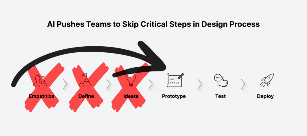
Junior designers rely on prompts instead of judgment. Senior designers are pulled into production firefighting instead of strategy.
It’s concerning when I see craft becoming optional, not intentional.
At the same time, leadership continues to pressure teams to “do more with less” accelerates the damage. Headcount shrinks, expectations rise, and AI is positioned as a substitute for experience rather than a multiplier of it. Design systems are bypassed, standards are relaxed, and consistency gives way to velocity.
What once took careful collaboration is now treated as a throughput problem.
The paradox is clear: AI should enable higher maturity, but without strong leadership, shared standards, and clear intent, it does the opposite. In 2026, the most mature design teams won’t be the ones using the most AI.
They’ll be the ones disciplined enough to slow down, think deeply, and use AI deliberately instead of desperately.
Conclusion
When I wrote about these design trends, I kept coming back to one idea:
Design is becoming human again.
We’re moving past screens that only look good toward systems that actually adapt, understand, and care about what people are trying to accomplish. Voice, gesture, AI prediction, and spatial context all adds up to experiences that feel personal, powerful, and sometimes emotional.
And yeah, that means designers need new muscles: empathy, systems thinking, intent modeling, and even psychology. But if you embrace that, you’re not just shaping interfaces – you’re shaping how people interact with technology at its deepest levels.
To me, that’s what makes 2026 feel exciting instead of intimidating.
What’s Next for Design?
I’d love to get your feedback on this post as well as any new trends in UX/UI design you’re predicting we’ll see this year. And don’t forget to go back and revisit my design trends of the past: 2024, 2023, 2022, 2021, 2020, 2019