User Experience (UX) design is the process of Experience Designers creating extraordinary products that provide meaningful and valuable experiences to customers.
One question that companies and UX teams constantly struggle with: how do you measure the success of UX? And more specifically, the feature-level UX?
For starters, UX metrics measure human behavior and attitude toward a particular experience, including aspects of branding, design, usability, and function. UX metrics are also vastly different than metrics used in sales, marketing, or finance. And there’s currently 127 UX KPIs and metrics! So it would take a lifetime to track and measure all of them successfully.
I created a list of my top 5 metrics to track feature-level UX, starting with the most accurate and popular…
1. User Tasks
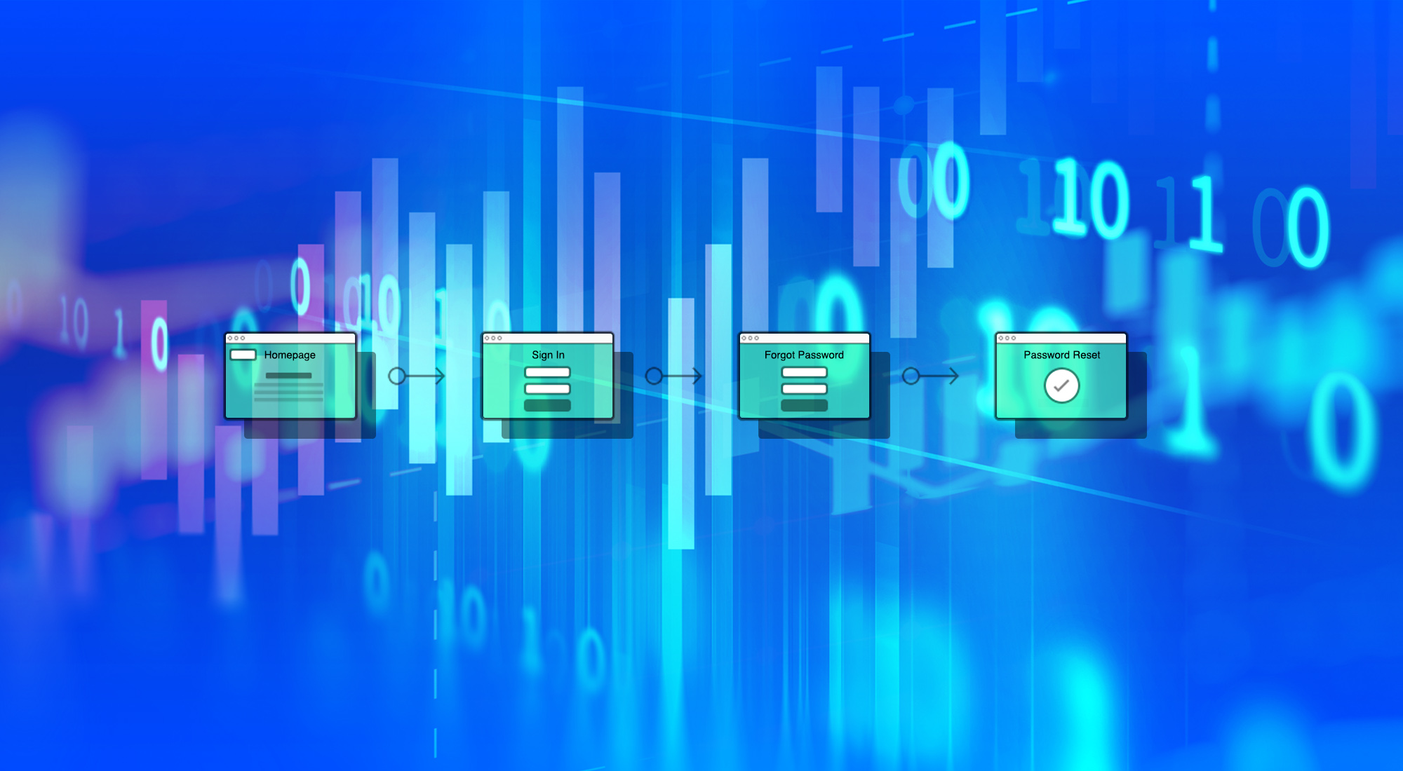
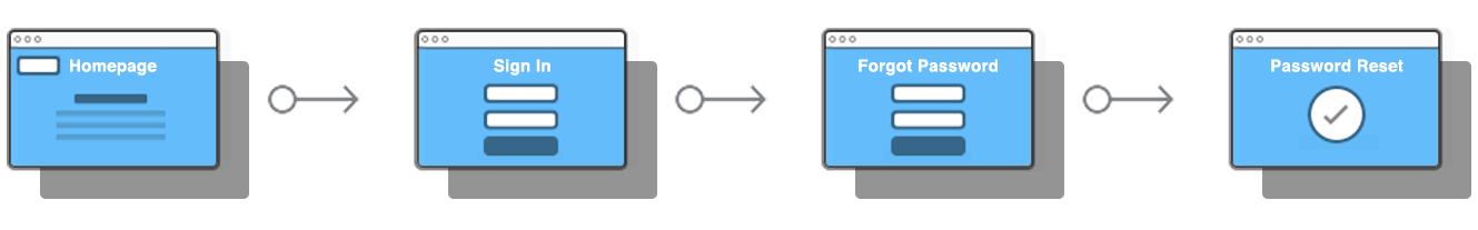
Tasks are a core tenet of UX because all great products help users accomplish one or more tasks in order to achieve a goal (e.g. reset a password, order food, etc.). User tasks are typically measured during usability testing after a user has attempted a task, or tracked within a user’s session on a digital product. These are the typical user task metrics that you should utilize:
- Task Success Rate (or Completion rate) – The percentage of users who successfully complete a task. This may be the most popular performance metric that reflects how effective users are at completing tasks, where it requires that the task have a clearly defined goal or end point (e.g. book a room, sign up, etc.) to measure the success rate.
- Error Rate – The percentage of users who made a mistake during a task (e.g. clicking the wrong button, etc.). Errors can tell you how many mistakes were made, where they were made in the product, how various designs produce different frequencies and types of errors, and overall how usable something really is. Most usability issues can sometimes be the source of user errors, so make sure you clearly define what action constitutes a failure and whether partial failure is calculated as an error.
- Average Number of Errors – The number of mistakes users made on average during a task.
- Time on Task (Task Completion Time) – The length of time (mins/secs) it takes users to complete a task, which is especially useful for measuring the potential impact on user productivity. Time on task data can be analyzed and presented in different ways, but the most common way is to present the average time spent on each task. This is a great metric for diagnosing problems. But the time-on-task metric gives more insight in a dynamic view, when comparing the same metric for different iterations. Generally, the smaller time-on-task metric, the better user experience.
- Ease of Completion – The ease with which users were able to complete a task. The single ease question (SEQ) (see below) is a good way to capture this.

2. Feature Ratings
Ratings are everywhere – from Amazon to TripAdvisor – and are a great way to judge the quality of a product or service. To get a better understanding of your product’s features, you can ask users to provide ratings for your primary features or journeys.

Stick with the standard 5-point scale, and if possible, capture not just the ratings, but the reasons behind the ratings by adding an open text field for qualitative feedback.
3. Feature-Level Usability
Usability is important to a product or service in order to understand the effectiveness of a user experience in helping users achieve goals. System Usability Scale (SUS) can provide either a high-level and/or feature-specific view of usability, depending on the type of questions you ask the users.
SUS clearly indicates whether a product has improved over time or it can even compare usability between dissimilar products. It’s highly popular because it’s very easy to administer, can be utilized with a small sample size, and where you can quickly run a range of tests on different assets, or the same asset over a period of time, and compare the SUS score.
However, SUS won’t tell you what’s wrong with your product – it simply classifies its ease of use, which is fine for the purpose of measuring the improvements of a specific feature or journey. User testing will tell you how to improve.

SUS consists of 10 survey questions (template available via usability.gov) that are asked following usability testing, where users rate their level of agreement on a five-point Likert scale (assigning a quantitative value to qualitative opinions). The questions – preferably randomized – cover a range of usability areas and help quantify the qualitative data, like user’s perceived satisfaction of the product.
The SUS scoring mechanism is a little confusing since the score is on a scale from 1 to 100, where a higher score means a better usability rating. Here’s the SUS scoring process: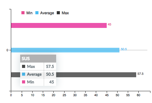
The participant’s scores for each question are added together, and then multiplied by 2.5 to convert the original scores of 0-40 to 0-100. It’s a relative score, so don’t ever convert the score to a percentage or bad things happen!
A SUS score above a 68 is considered above average and anything else below average. A SUS score is great for benchmarking usability, such as in comparison to the product prior to a change, or against competitors’ products, features, and/or services.
4. Conversions
Conversions are essentially getting someone to respond to your call-to-action. Getting someone to open an email, signing up on your site, or buying your product are all conversions.
The most helpful way to utilize Conversions to track UX is when you’ve made a UX improvement to a specific task that leads to more conversions. For example, if you’ve simplified the registration process and then seen higher conversions.
The problem with using Conversions for UX improvements is that higher conversion may also be a result of marketing efforts, so you’ll want to track the Conversion Rate = Number of Sales / Number of Visits x 100%.
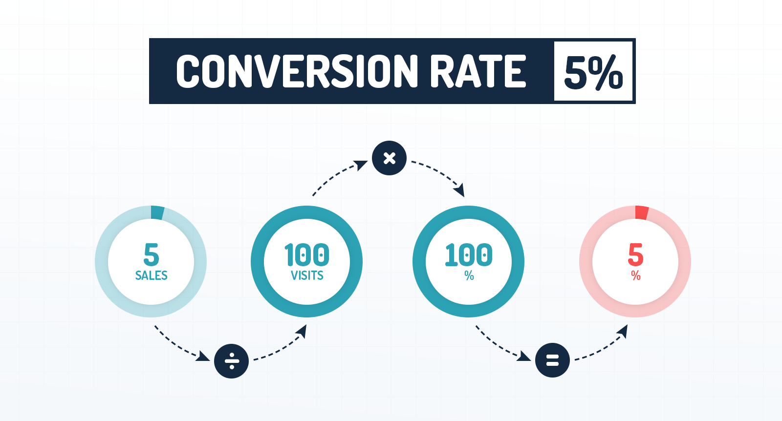
I should note that you shouldn’t necessarily trust conversion rate as the solution to all your problems. Remember that not all visitors to your webpage have the potential to convert, or that conversion rates vary wildly based on visitor type.
5. Task Performance Indicator (TPI)
Task Performance Indicator (TPI) measures the impact of changes on user experience. You’ll test between 13 – 18 participants separately, where you ask each user to perform 10-12 task activities to test your highest priority tasks in your product. Each user is presented with a single task activity. And once they’ve completed the activity, they answer a question along with a confidence level in their answer.
TPI tracks the following:
- Target Time – Optimal time it should take to complete the task under best practice conditions
- Time Out – The person takes longer than 5 minutes
- Confidence – At the end of each task, people are asked how confident they are:
- Minor wrong: the person is unsure; their answer is almost correct
- Disaster: the person has high confidence, but the wrong result
- Gives up: the person gives up on the task.
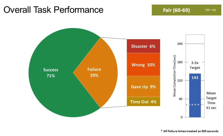
The theory is that if a task has a TPI score of 40 (out of 100), it has major issues. You’ll want to deploy the same testing at least every six months to see if the score changes.
Conclusion
The UX success metrics I mentioned in this post provide incredible insight into the size and magnitude of usability issues at the feature-level, where they help your team easily track their performance over time and even compare them to competitors’ features. Each metric has their drawbacks, so I recommend using more than one metric to measure and track feature-level performance.
What UX metrics do you use to track feature-level UX performance?
Read my next post on product-level UX success metrics >