
COMPANY // Amazon 
PRODUCT/SERVICE // Amazon.com website with Prime
In Part 1 of my journey on redesigning the Amazon.com web experience, I provided details of Design the Right Thing from the Double Diamond design approach. I spoke at length into the business & product analysis and user research (e.g. user interviews, etc.) to better understand Amazon’s customers, and how I synthesized those insights (e.g. pain points, unmet needs, etc.) into defining the necessary design artifacts (e.g. personas, journey map, design principles, etc.).

Today I’ll dive into the Phase 2 Design phase of reimagining the Amazon.com web experience utilizing Prime, where I’ll start with a divergent design phase, where we ideate and conceptualize the new experience by developing multiple options (by usability testing). Design studio sessions are initiated to brainstorm design solutions. Feature prioritization and MoSCoW* mapping are important tools to reign in featuritis.
Design Principles
As I explained in my post about The Importance of Design principles, they are an extraordinary tool that I utilize on all of my design projects, because they really help designers go beyond the basics of product design (i.e. enhancing usability, increasing engagement, etc.) to mashup the business of design with your specific goals/needs/wants of your customers.
Design Principles are really the essence of design leadership.
“Design Principles are first principles that serve as the design foundation for a project in the form of design recommendations that guide each design decision your design team makes as they’re working on a design project – providing the necessary focus to create a kick*ss aesthetic and experience that’s consistent throughout the product that your users will absolutely love.”
These are the design principles that I developed for the Amazon.com redesign…
Be Consistent
Navigational mechanisms, organizational structure and metaphors used throughout the design must be predictable, reliable, and follow Amazon’s brand & design standards. When things don’t match up between multiple areas, the experience can feel disjointed, confusing and uncomfortable. Consistency implies stability, and people always want to feel like they’re in good hands.
Less is More
It’s important to ensure everything in the design has a purpose; if it’s not adding to the overall positivity of the experience, then remove it. Reduce the design to the necessary fundamentals and people will appreciate the simple beauty.
Use Emotion
Pleasurable is an important measure of a positive user experience. Designs should have flourishes of warmth, kindness, whimsy, richness, seduction, wit — anything that incites passion and makes the person feel engaged and energized.
Group Related Objects Near Each Other
Layout is critical to creating meaningful and useful experiences. As a person scans a page, they form an understanding about what we can do for them and what they can do for themselves using our services. To aid in that learning process, and to motivate interaction, don’t force users to jump around disparate areas to carry out a single task.
Present Few Choices
The more choices a person is presented with, the harder it is for them to choose (i.e. the paradox of choice). Remove the superfluous and provide the minimal choices a customer needs to accomplish a task or goal.
Stay Out of People’s Way
When someone is trying to get something done, they’re on a mission. Don’t interrupt them unnecessarily and don’t setup obstacles for them to overcome. Our designs should have intentional and obvious paths, and keep users in the moment to allow them to complete tasks quickly and freely.
Be Credible and Trustworthy
We have to earn our customers’ trust — do what we say we’re going to do, don’t over promise and under deliver, don’t break that trust to fulfill a business objective. If you set people’s expectations appropriately and follow through in a timely matter, they will give us more leeway and loyalty in the future.
Provide Feedback
Tell customers why they’re waiting. Tell them that you’re working. Tell them you heard them and offer the next step along their path. Design is not a monologue, it’s a conversation.
Ideation
I spent some time brainstorming and ideating various solutions for the Amazon.com web experience, utilizing my design principles for guidance.
Sketching is my favorite medium for this exercise because it’s quick and easy to develop 10-20 low fidelity concepts on my own in a very short period of time. This period of time is an intense creative session, where I get comfortable and allow my creativity to dream and explore and let my pen/pencil be the vessel to document, organize, and design anything from strategy to design to user flows.
This also works great to ideate within a team or client setting because everyone can sketch, no Leonardo da Vinci’s required.

Not all of these ideas will be revolutionary ideas, but that’s not quite the point.
The point is to have a ton of various thoughts to work from and build upon as a group. From these concepts a few gold nuggets can emerge, like this idea I sketched of a super simple Amazon.com experience with plenty of spacing, few items, and a utility bar on the right side to quickly access common info/features (profile, cart, shipping, help).
Developing a New Product Vision for Amazon.com

With the design principles and a few pages of sketches to work from, I crafted a vision for the new modernized Amazon.com website that will align with Amazon’s corporate vision and business goals while solving the challenges and unmet needs of its customers.
Just like branding, painting, or any other creative endeavor, I’ve found the best way to create a vision is to start with prose to better engage the free flow of your thoughts and deepen your connection to the creative exercise.
In this case, I created a story from the customer’s perspective…
An infrequent Amazon Prime customer returned to Amazon.com and was profoundly amazed at the redesigned experience that was highly personalized, and fun and easy to navigate via a simple and clean interface. “Wow!”, he exclaimed under his breath, “I can’t believe how streamlined the experience is and how quickly I can find everything I need… and these product recommendations seem tailored for me!” He was happy to see the experience more consistent throughout the site, the design finally updated to a modern and sleek look, and he loved the activity bar that provided a central place for most of his common interactions (account, shopping cart, help) and even some new ones… “What’s this, notifications? Shipping info? Product recommendations from friends and family? Awesome! Maybe I can finally figure out what dog treats my brother keeps raving about on here.” He leaned back in his chair, “it’s like Amazon redesigned this site just for me.”
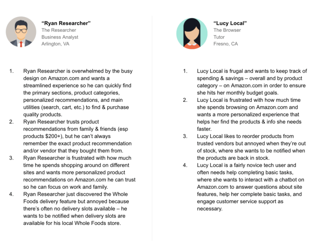
User Scenarios
From this vision, I created a few user scenarios to show how shoppers might act to achieve a goal in a system or environment. Designers make scenarios to understand users’ motivations, needs, and barriers in the context of how they would use a design, as well as to help ideate, iterate, and usability test optimal solutions.
Wireframes
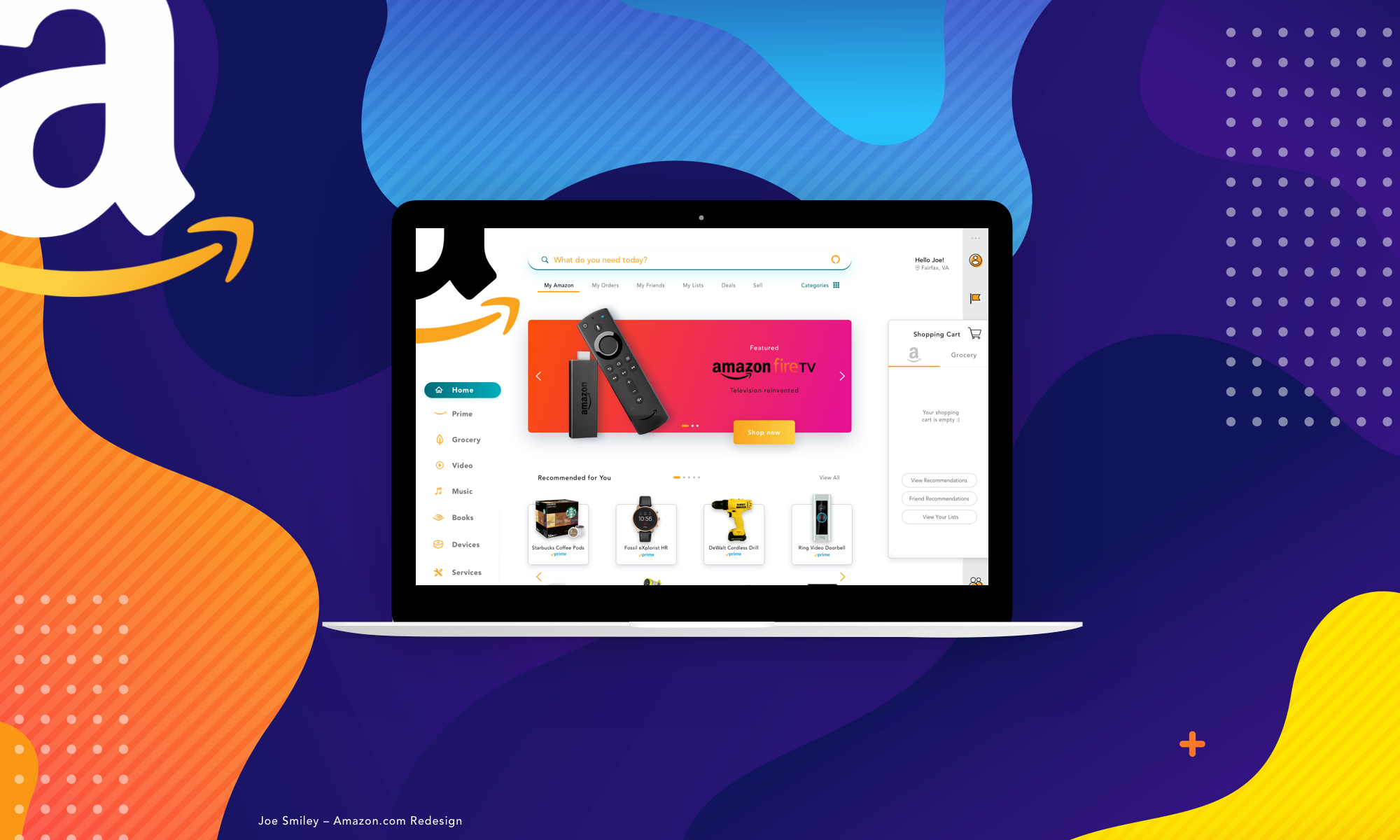
I crafted a set of mid-fi wireframes for my new concept of the reimagined Amazon.com web experience, starting with the homepage and then progressing through a search results page and product page. The primary objective I had was to keep it simple, simple, simple.
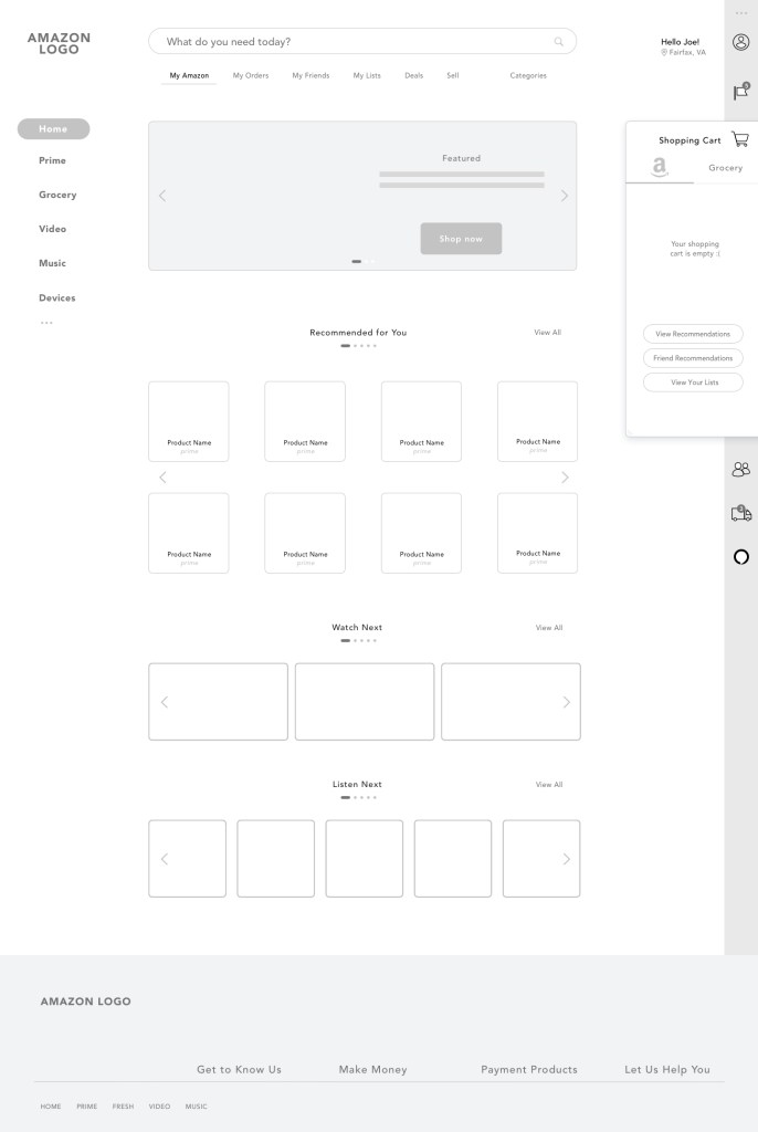

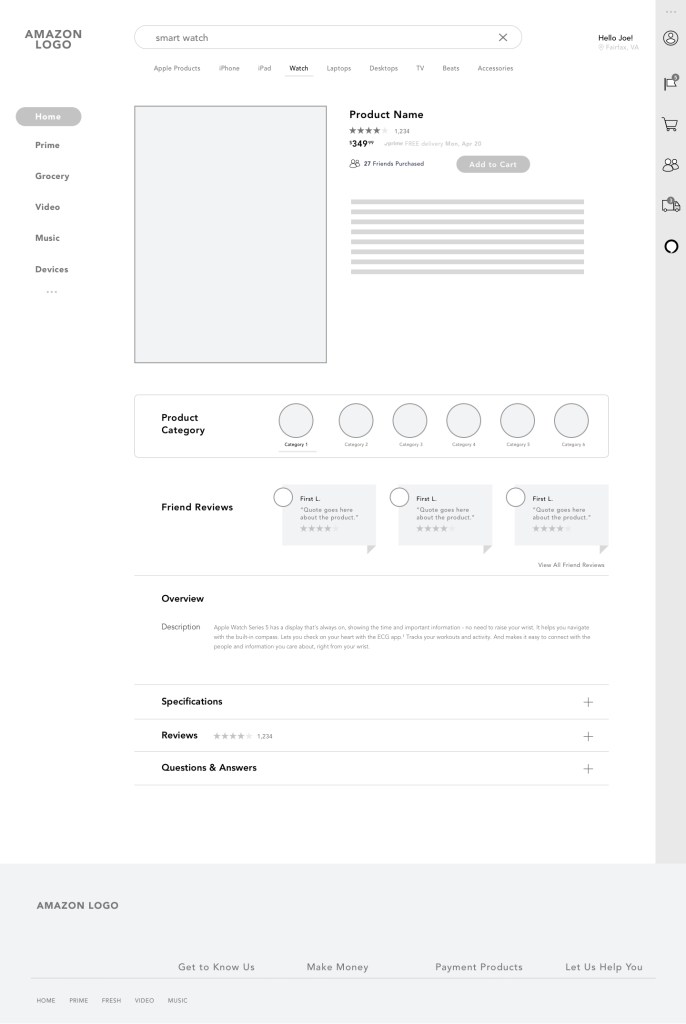
I then turned my attention to designing the utility bar on the right side of the screen. This right hand rail already displays the cart when a shopper has added an item, so I set out to expand the utility of this area to include other easy accessible features (via modal windows) like my profile, notifications, friends, tracking packages, and customer support via Alexa AI chatbot.

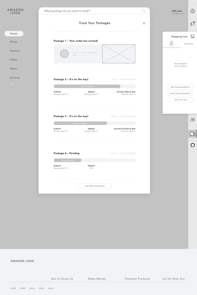
Wireframes are a great way to visualize the entire experience and quickly make adjustments. The iterative design process can be repeated as often as necessary with mid-fi wireframes.
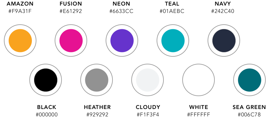
Visual Design
I set fire to the old Amazon brand standards (do they even really exist in the first place?) and redesigned the Amazon brand with a sleek and modern personality accented by bold modern colors that would befit Kanye, nobility, or perhaps the king of ecommerce.
The result is quite extraordinary IMHO, where the new experience is revolutionized with a new personality, innovative features, and streamlined experience!
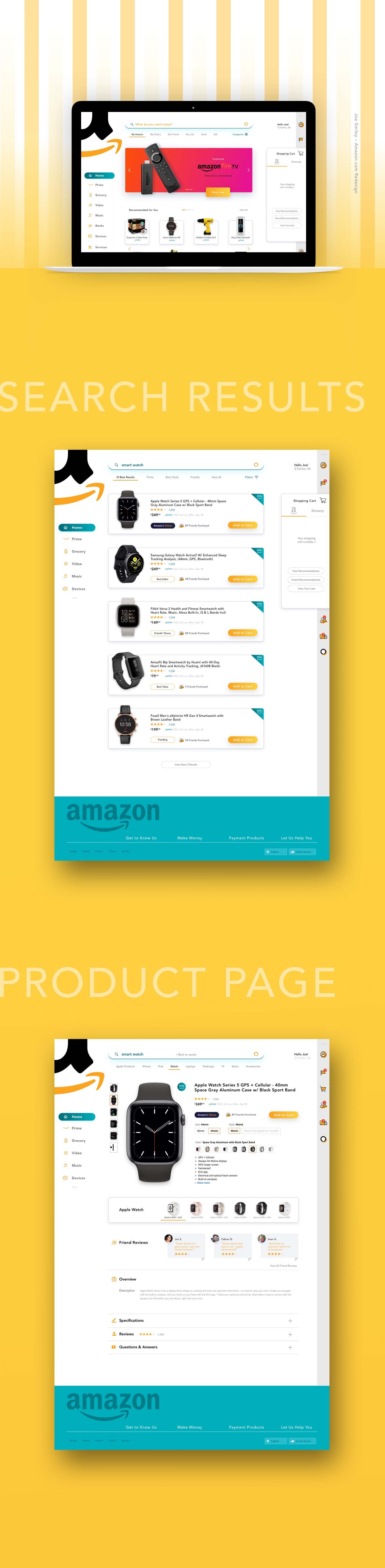

Prototype
I was able to utilize the final mockups to create a prototype that enables testing the new experience concept, where I highly recommend usability testing early in the design process so that feedback is gathered when changes can be implemented easily.
Conclusion
Taking a Human-Centered Design approach to reimagine the shopping experience on Amazon.com is quite effective, even without a large design or user research team. Now if only the folks at Amazon will take a look at what’s possible and get to work rethinking their site with customers in mind… or they can just call me 🙂
So what do you think? Would be great to hear all feedback, so leave a comment below.